
CSS-in-JS with near-zero runtime, SSR, multi-variant support, and a best-in-class DX. A project by @WorkOS.
- Tweets 387
- Following 0
- Followers 4,624
- Likes 852










Stitches retweeted

I haven’t been excited by tech tooling since Next.js 2 years ago.
I’m feeling that way about @stitchesjs now.
4
15
Stitches retweeted

These will be the available packages for @stitchesjs beta:
- @stitches/core ~2.3kb
- @stitches/react ~0.5kb
More about each one below ▼
1
6
48
Stitches retweeted
We're 🤏 this close to launching @stitchesjs beta
Want to help test? Join our discord!
discord.gg/kSQw3pnW
1
15
Stitches retweeted
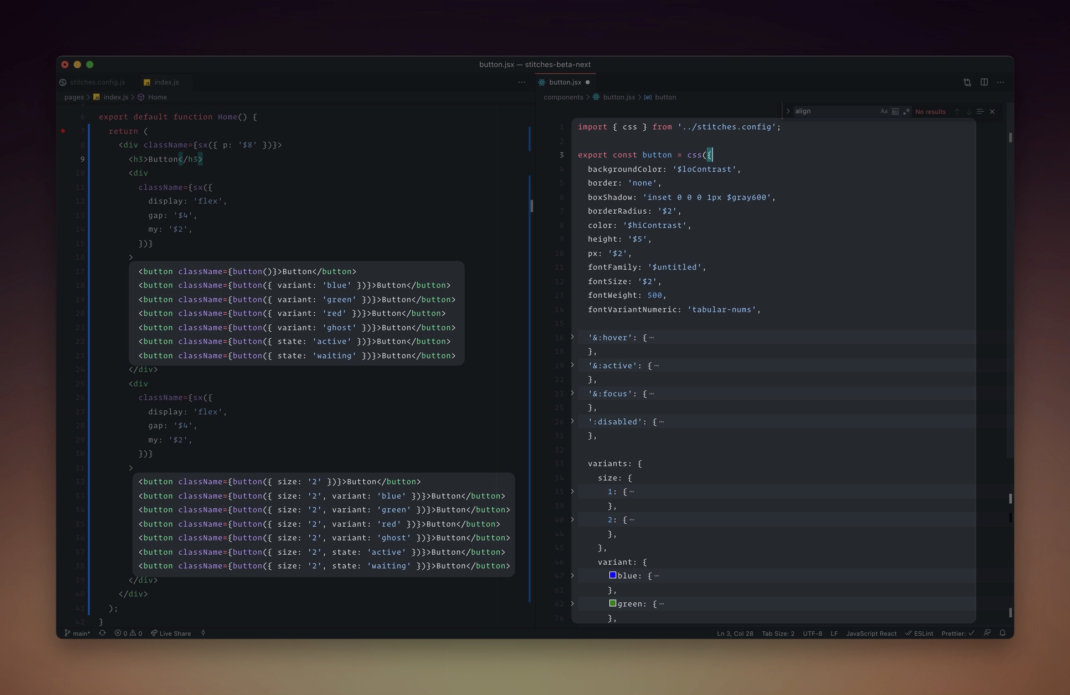
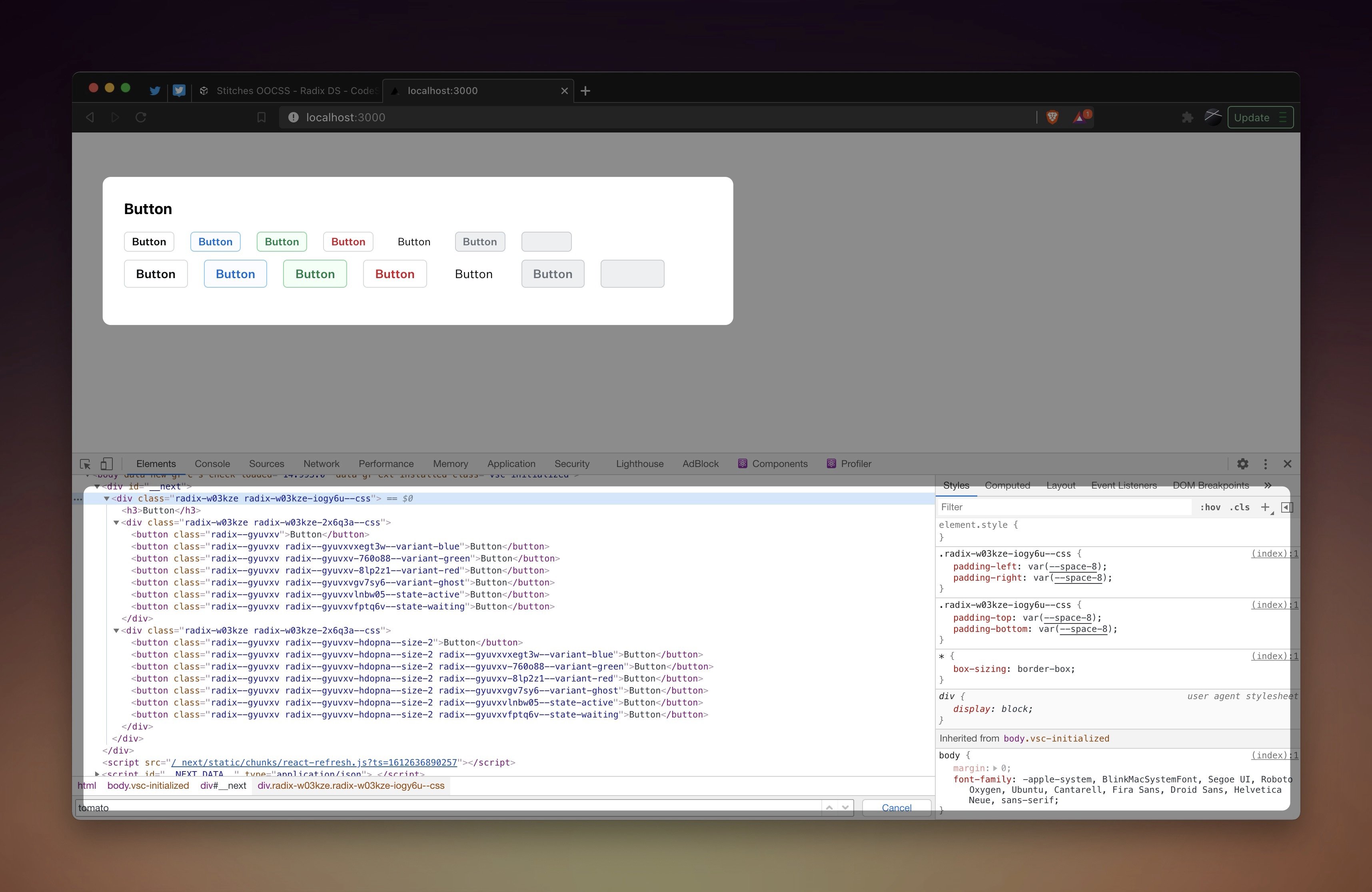
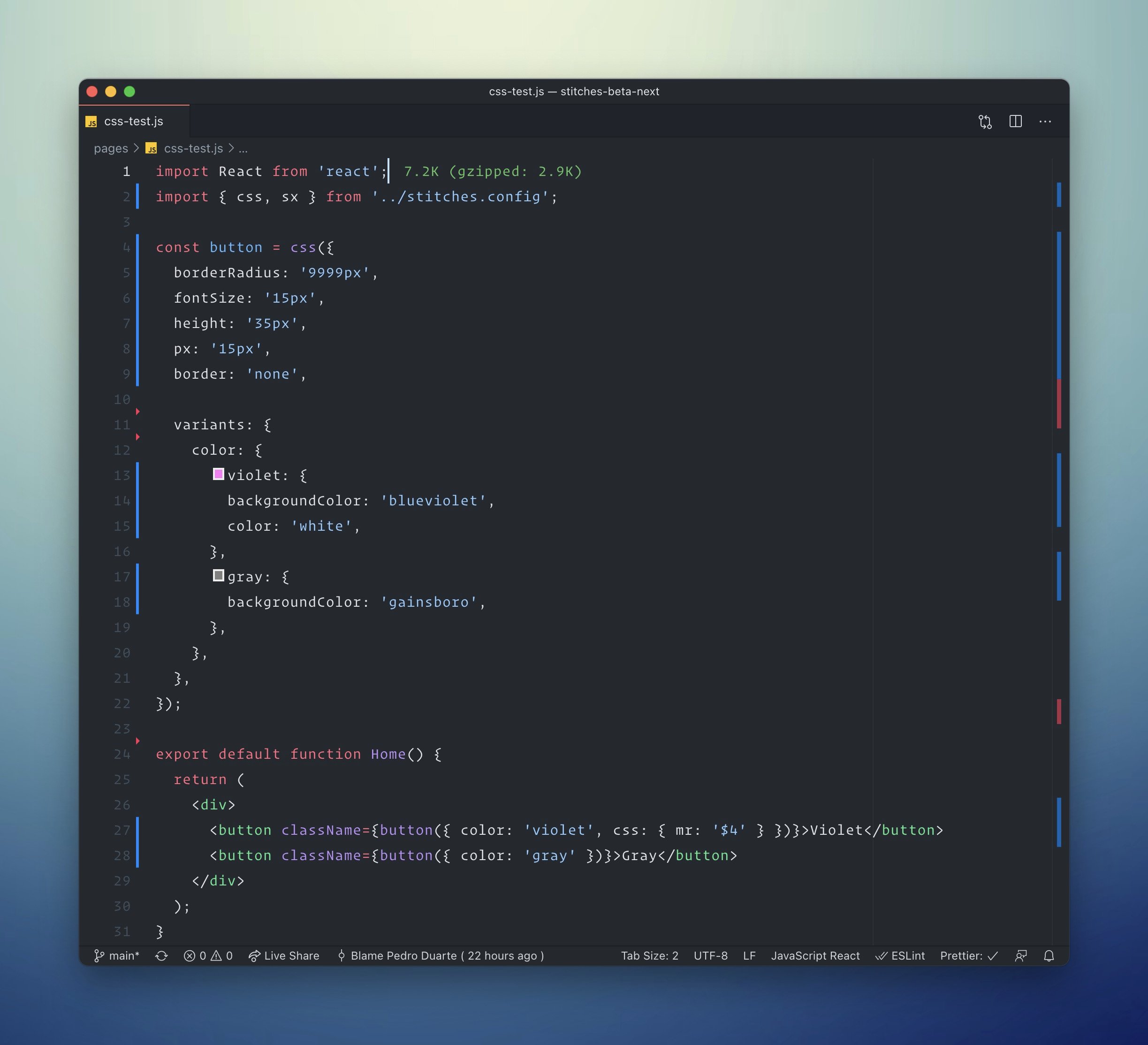
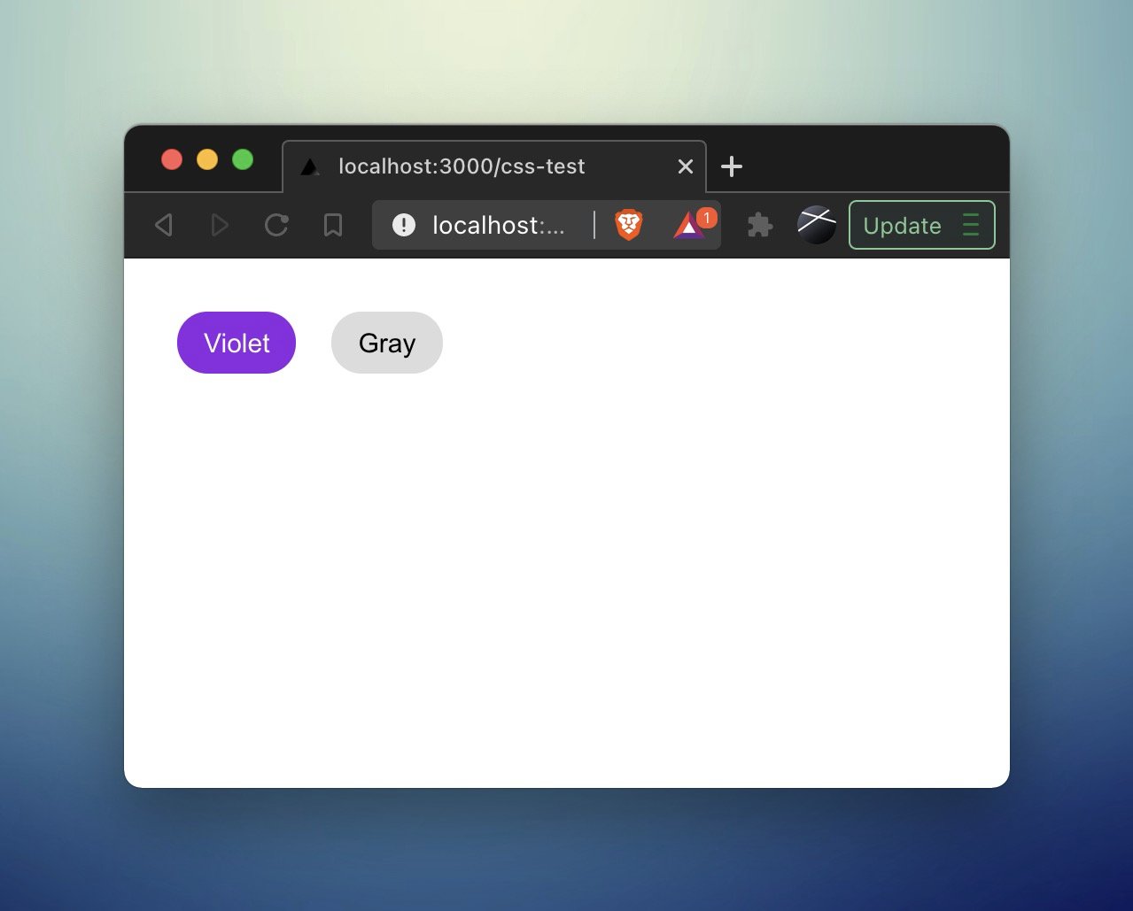
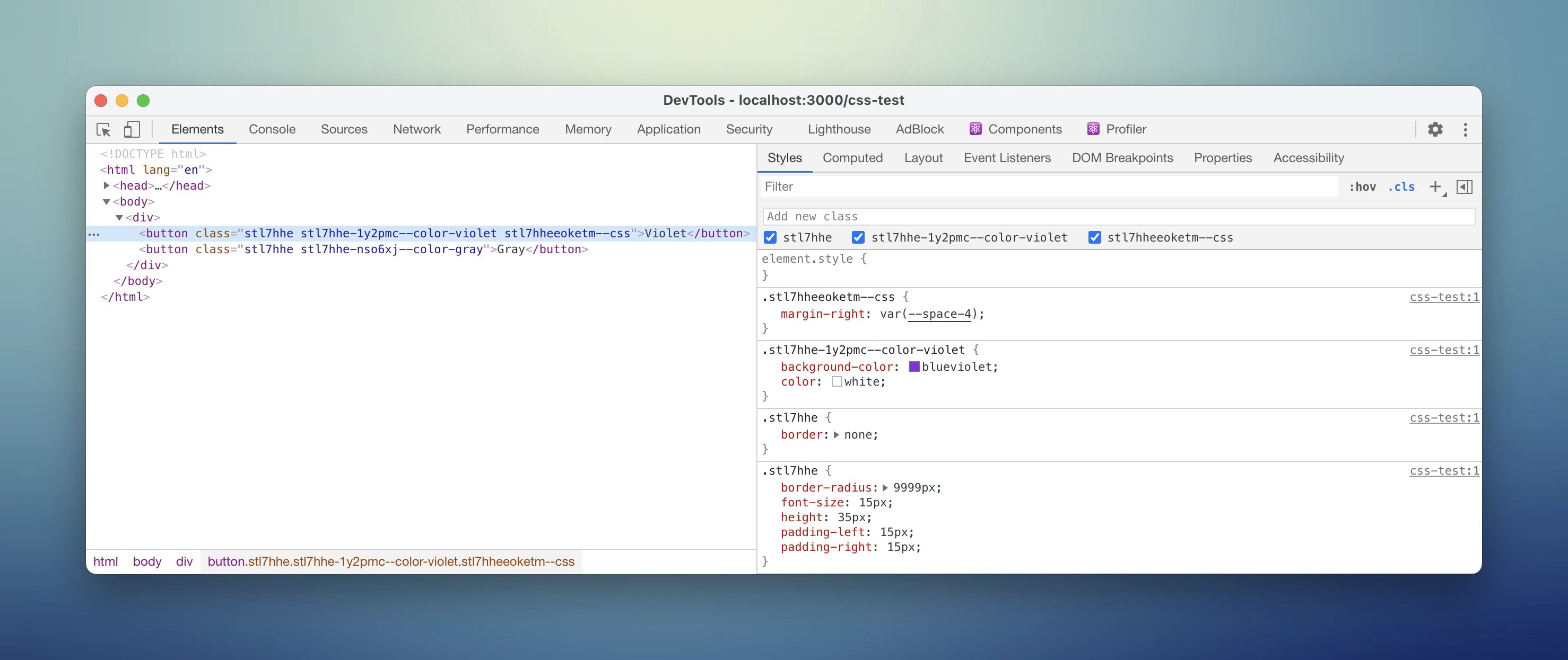
👀 sneak peek of @stitchesjs beta
The generated class will contain a hint of whether the style as added via a variant or an override
This also allows you to toggle entire variants/overrides on and off when debugging. Love it!
A nice debugging experience improvement 🥳
3
3
37
Stitches retweeted
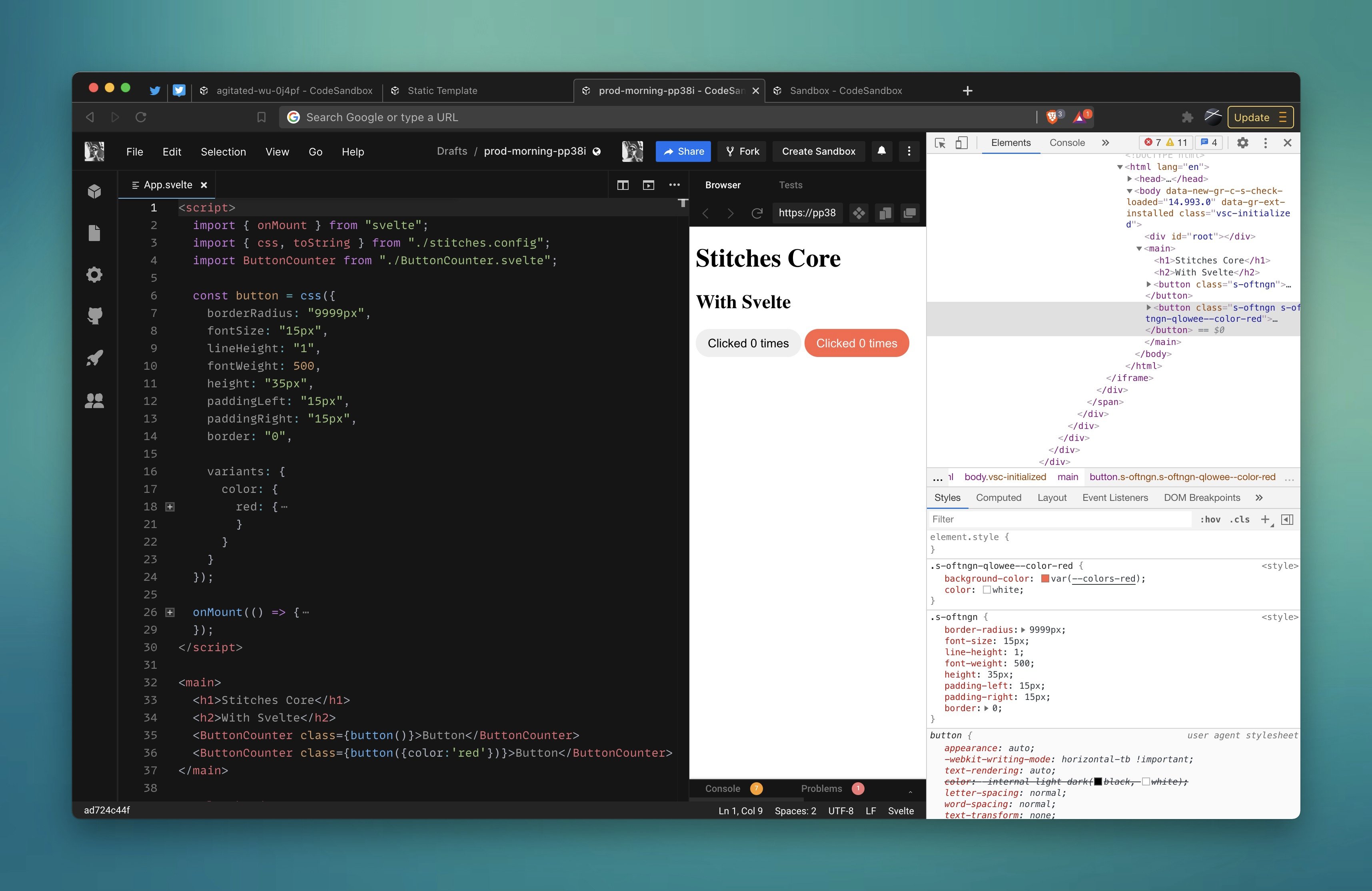
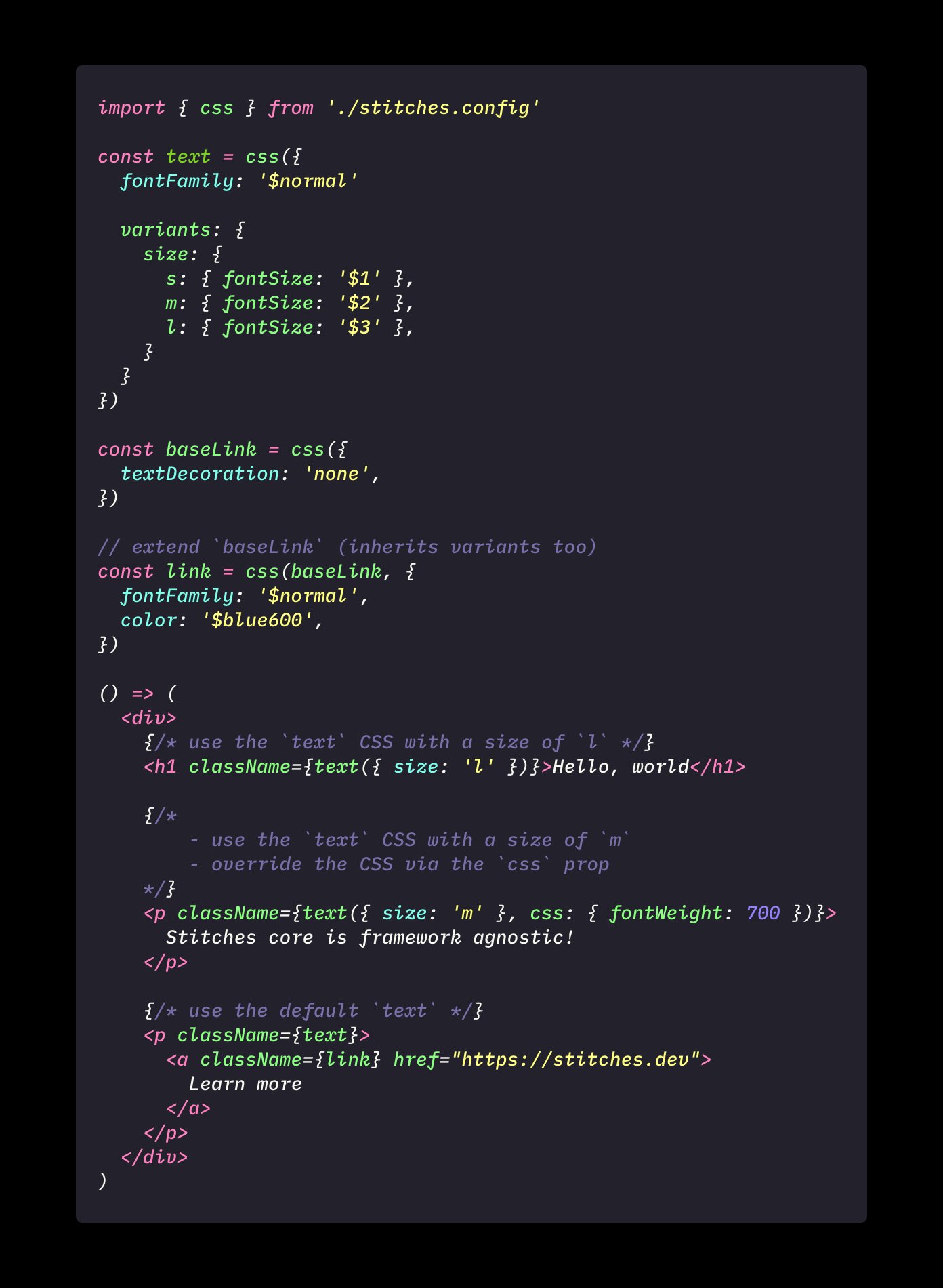
I love the `styled` API of @stitchesjs - it returns a typed polymorphic React Component, with your variants as props
But the more I use the core API the more I love it ❤️
```
const button = css({ color: '$red600' })
<button className={button} />
```
✨framework agnostic✨
3
4
34
Stitches retweeted

I got a demo too, it's 💯
The React version is ~2.3kB (including core). Better typing. Better DX. Better performance.
Just a couple more weeks.

Spent the day testing the beta version of @stitchesjs that @jon_neal's been working on and holy shit it's so good
2
1
16
Stitches retweeted
Spent the day testing the beta version of @stitchesjs that @jon_neal's been working on and holy shit it's so good
2
1
23
Stitches retweeted
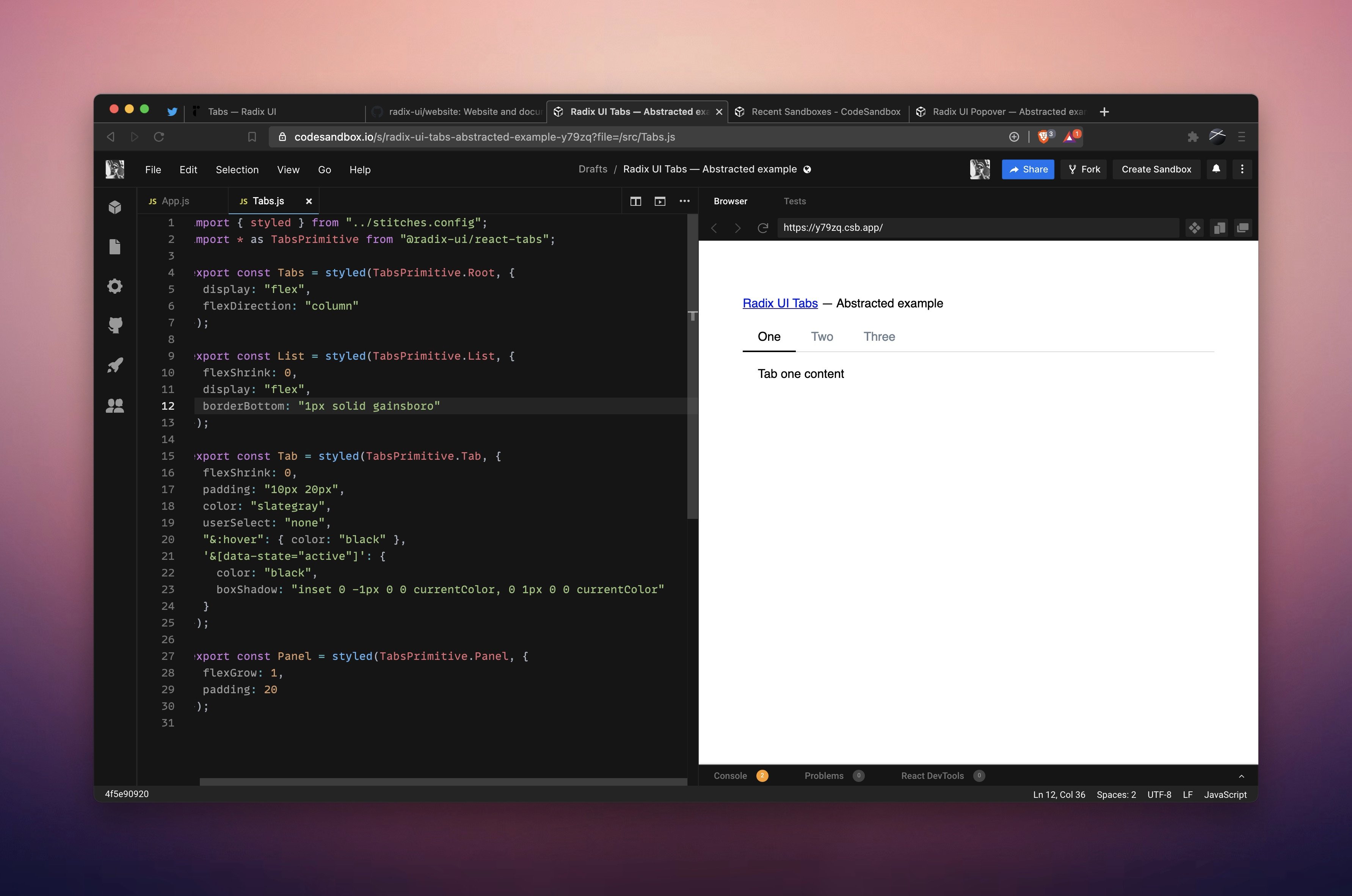
The Tabs Primitive is a good example of encapsulating styles
1. import from @radix_ui
2. add styles (in this case with @stitchesjs)
3. export
fully accessible component ready to go ⚡️
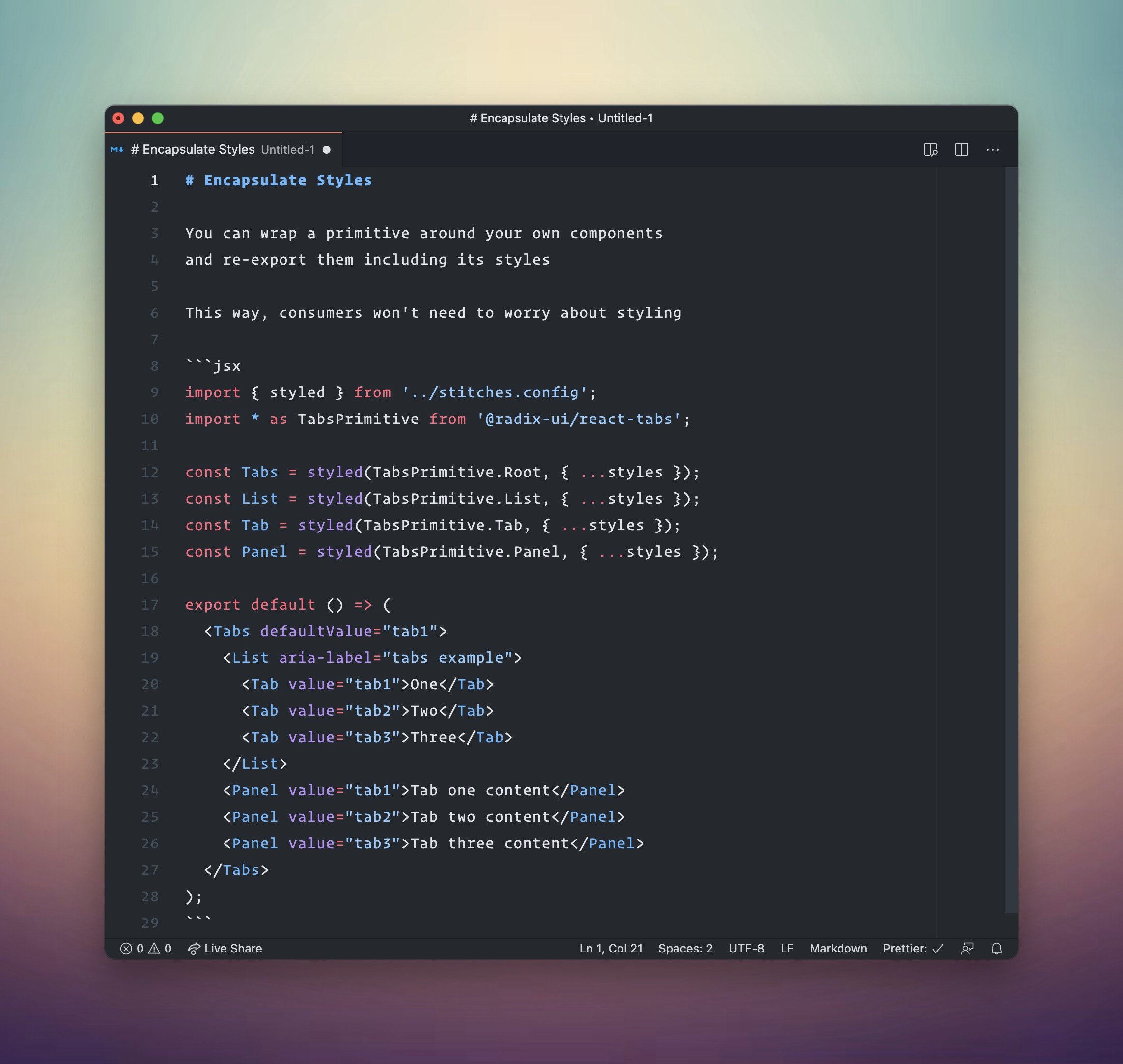
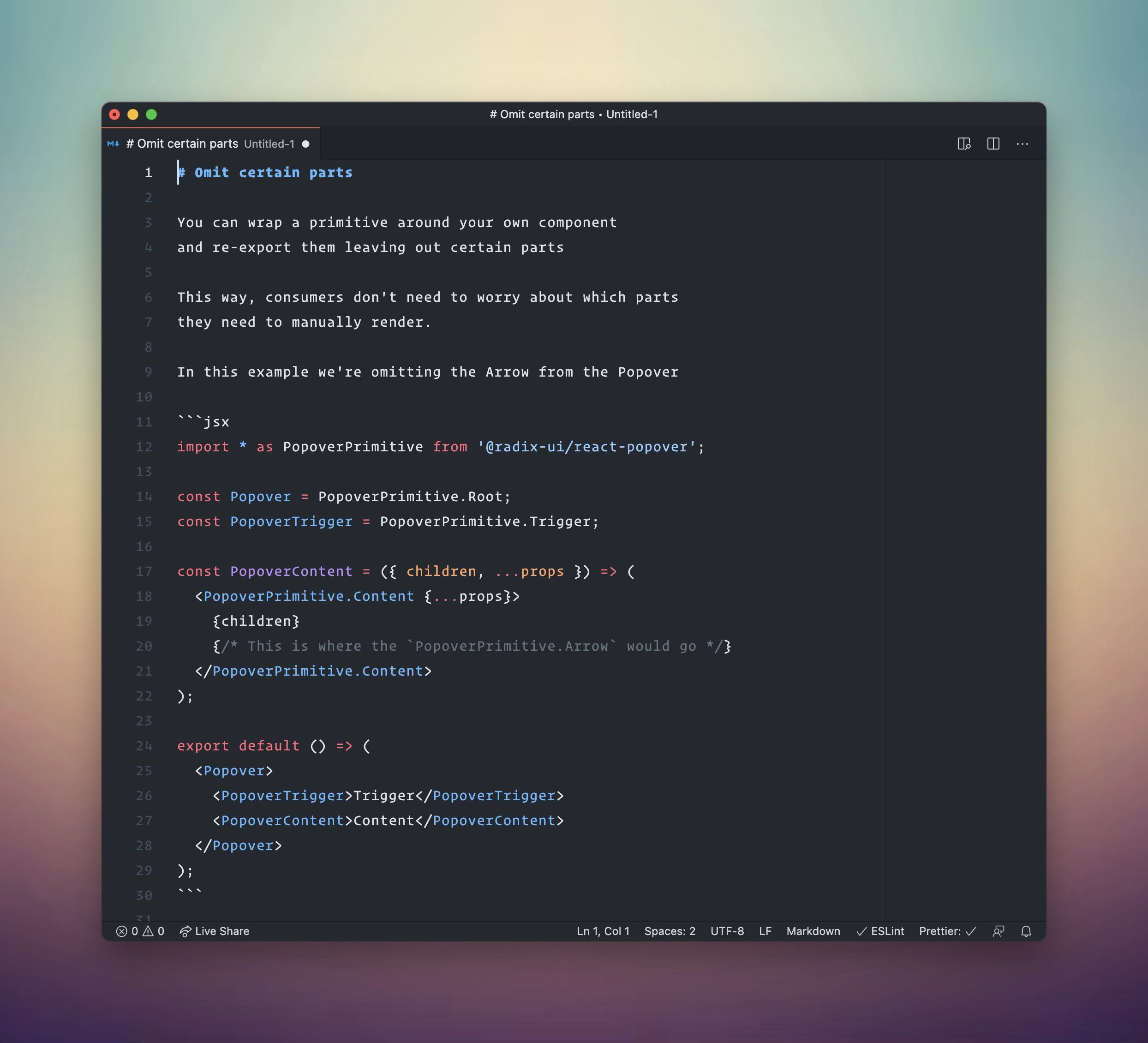
Some reasons why you may want to "wrap" a @radix_ui Primitive and re-export it as your own
- choose your own API
- omit certain parts
- encapsulate behavior
- limit use cases
- encapsulate styles
- build design systems
a couple of examples 👇️
1
2
8
Stitches retweeted

First time making use of @radix_ui and it went so smooth. Especially with @stitchesjs already in place
2
3
6
Stitches retweeted
Another cool thing is that it’ll work seamless with @stitchesjs and other libraries that follow the System UI Theme Spec
import colors from 'radix-ui/colors'
import { createStyled } from '@stitches/react'
const { styled } = createStyled({
tokens: {
colors
}
})
3
6
Stitches retweeted
👋 Over the next few weeks, I'll mainly be tweeting about
- @stitchesjs: coming out of beta
- @radix_ui: lots of new primitives, ready-to-use design systems, colors and more
- @modulz: true collaboration between design-dev
Hit me up for demos, live streams, podcasts, etc 🍿
4
6
57
Stitches retweeted
Which naming do you prefer for color variables?
A)
blue-bg1
blue-bg2
blue-bg3
blue-bg4
blue-line
blue-border
blue-borderHover
blue-pure
blue-text
B)
blue100
blue200
blue300
blue400
blue500
blue600
blue700
blue800
blue900
23%
A
53%
B
24%
🍿
466 votes • Final results
10
3
5
Stitches retweeted

.@stitchesjs by the folks at @Modulz is by far the most impressive implementation of a utility-first approach to styling. With a good configuration, I’d wager you’d have all the productivity of tailwind, minus the API shortcomings. In a TS project it’s even better 🔥
2
3
15
Stitches retweeted

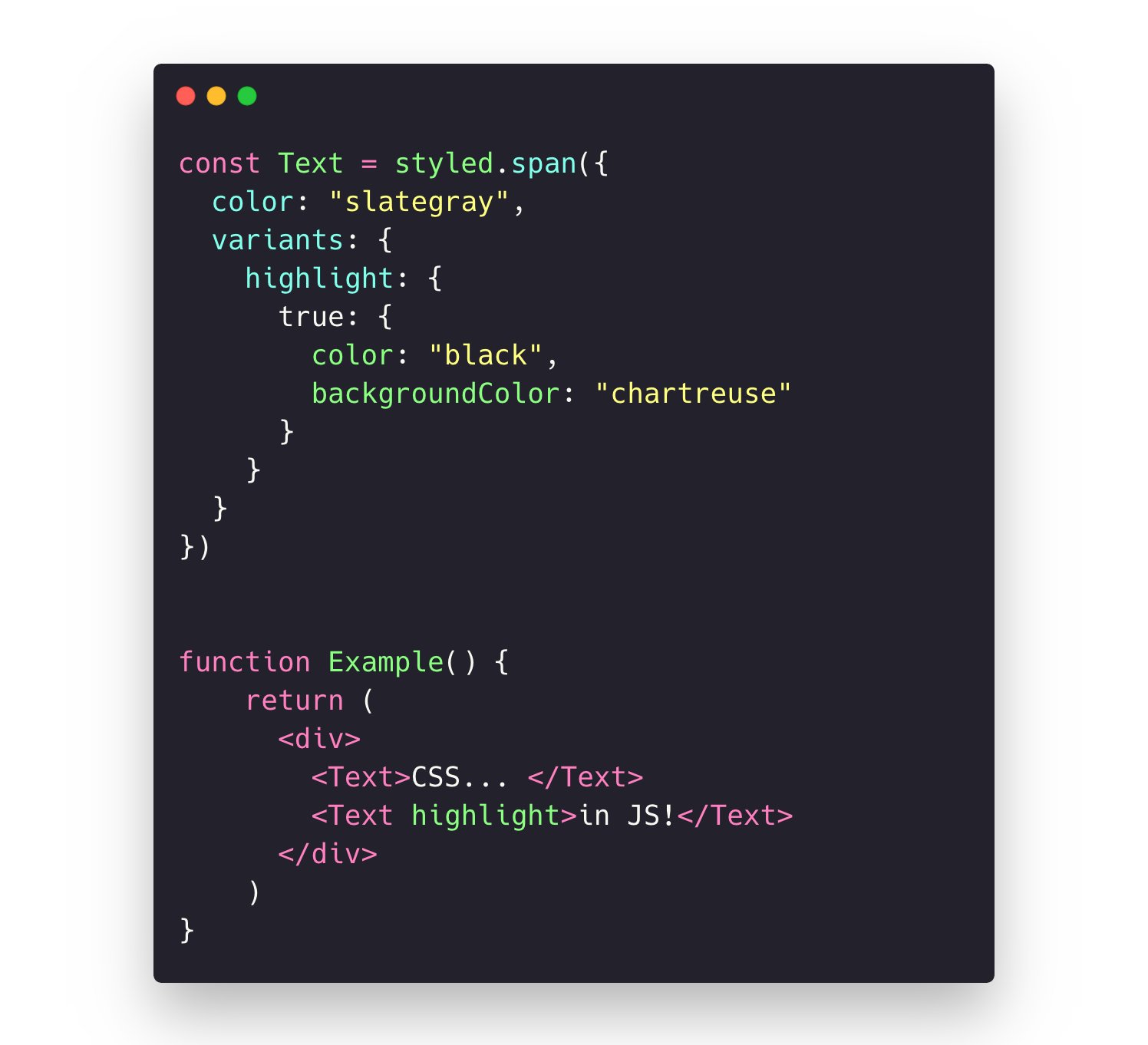
Just discovered that @stitchesjs supports booleans (or at least true) for its variants. 😗
2
27
Stitches retweeted
The app is styled with @stitchesjs and the view's code scope includes a set of pre-styled components that consume tokens from the app's current theme. They're also wrapped with Framer Motion props, so animation is a breeze too (see the gif in the first post).
1
1
2
Stitches retweeted
Just wait for @stitchesjs v1. Built from the ground up. Much better typing too.
1
11