
Toolkit with accessible components, styles, and examples for your next web app
- Tweets 556
- Following 4
- Followers 2,569
- Likes 764





![The following JSX code:
const [keyShortcuts, setKeyShortcuts] = useState("Mod+B");
useShortcutCommand({
keyShortcuts,
handler: formatBold,
});
<ShortcutInput
keyShortcuts={keyShortcuts}
setKeyShortcuts={setKeyShortcuts}
/>](/pic/orig/media%2FGak-DVgXgAA6Rhi.jpg)
ALT The following JSX code: const [keyShortcuts, setKeyShortcuts] = useState("Mod+B"); useShortcutCommand({ keyShortcuts, handler: formatBold, }); <ShortcutInput keyShortcuts={keyShortcuts} setKeyShortcuts={setKeyShortcuts} />
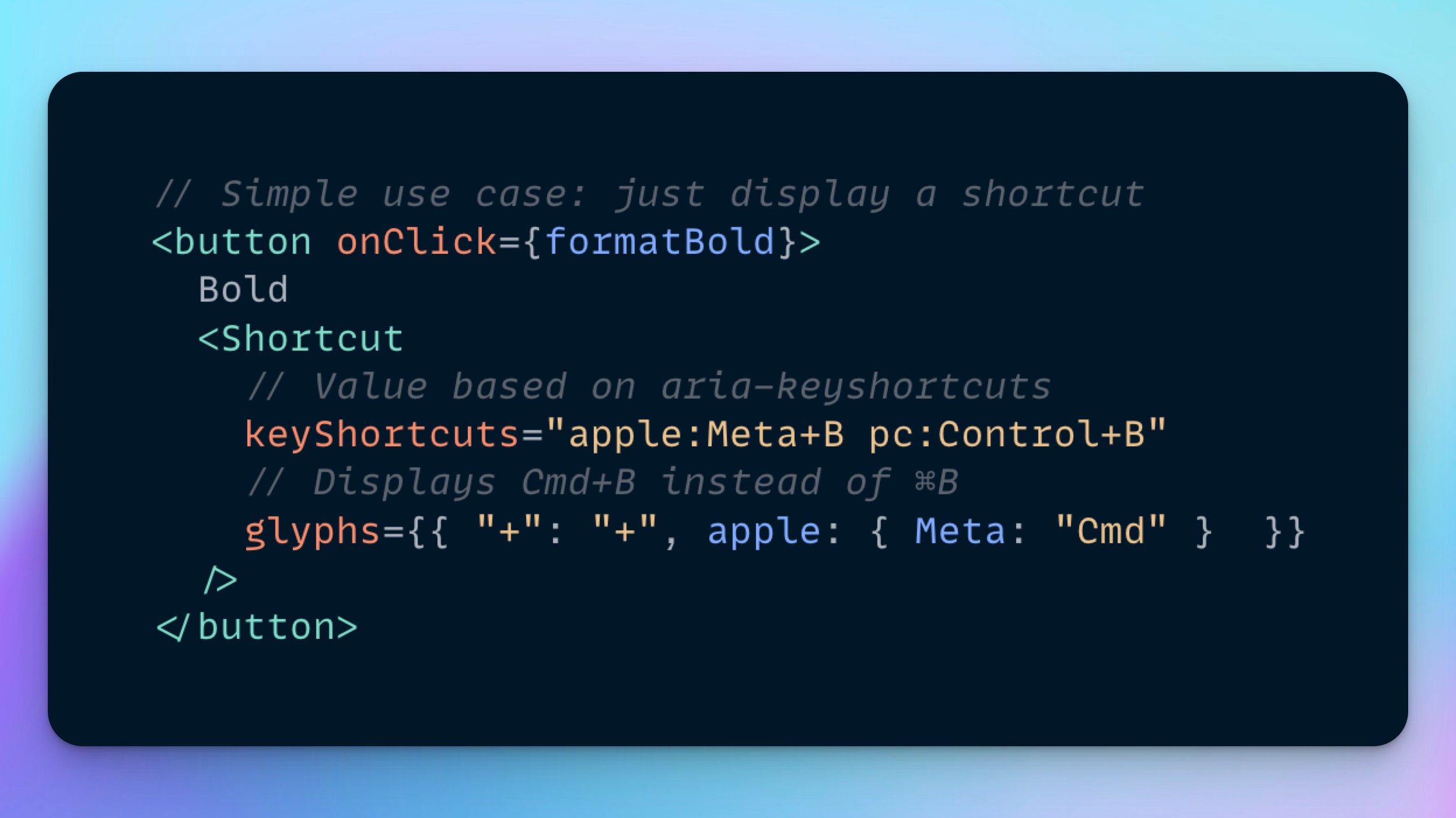
ALT The following JSX code: // Simple use case: just display a shortcut <button onClick={formatBold}> Bold <Shortcut // Value based on aria-keyshortcuts keyShortcuts="apple:Meta+B pc:Control+B" // Displays Cmd+B instead of ⌘B glyphs={{ "+": "+", apple: { Meta: "Cmd" } }} /> </button>
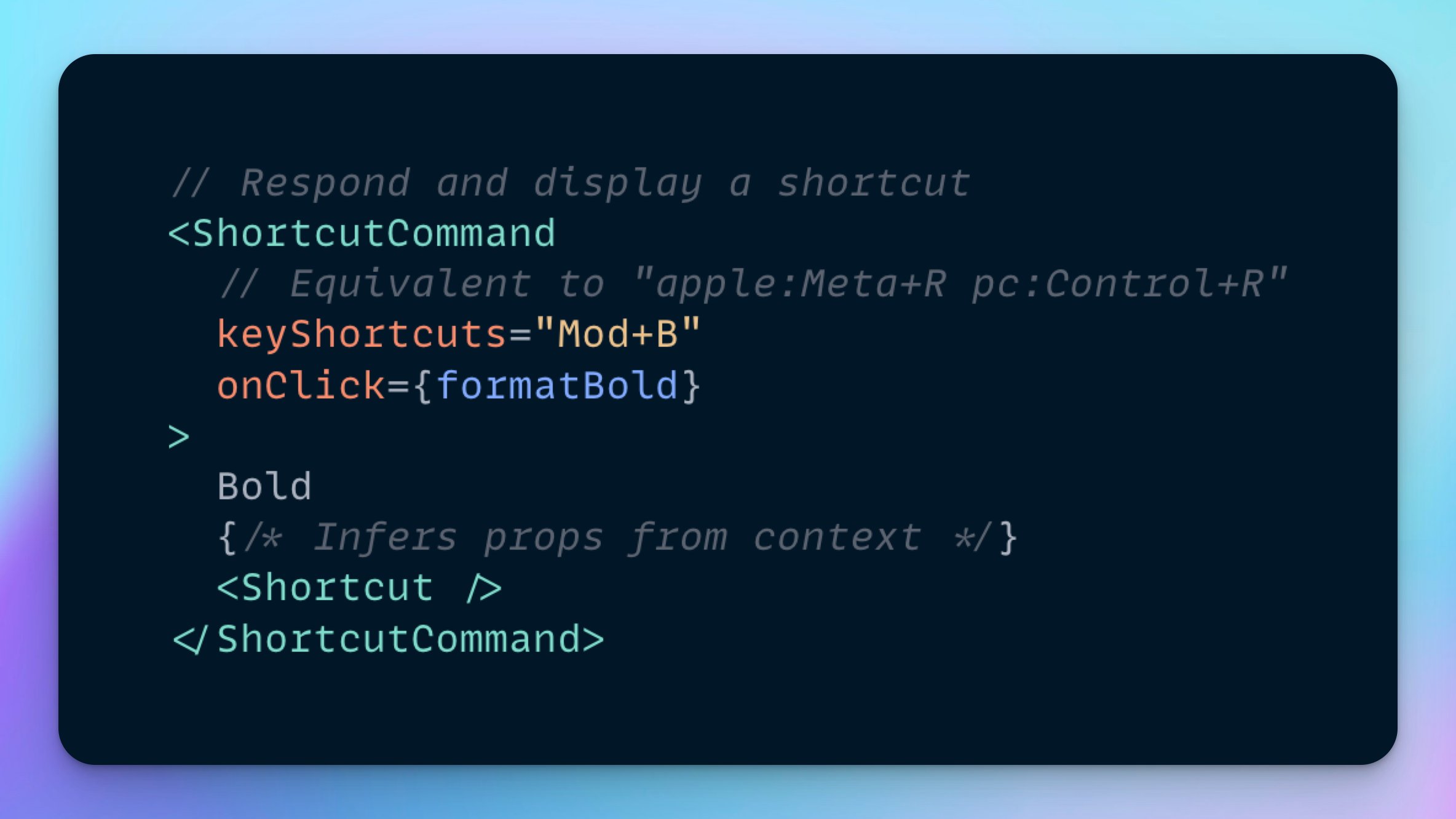
ALT The following JSX code: // Respond and display a shortcut <ShortcutCommand // Equivalent to "apple:Meta+R pc:Control+R" keyShortcuts="Mod+B" onClick={formatBold} > Bold {/* Infers props from context */} <Shortcut /> </ShortcutCommand>
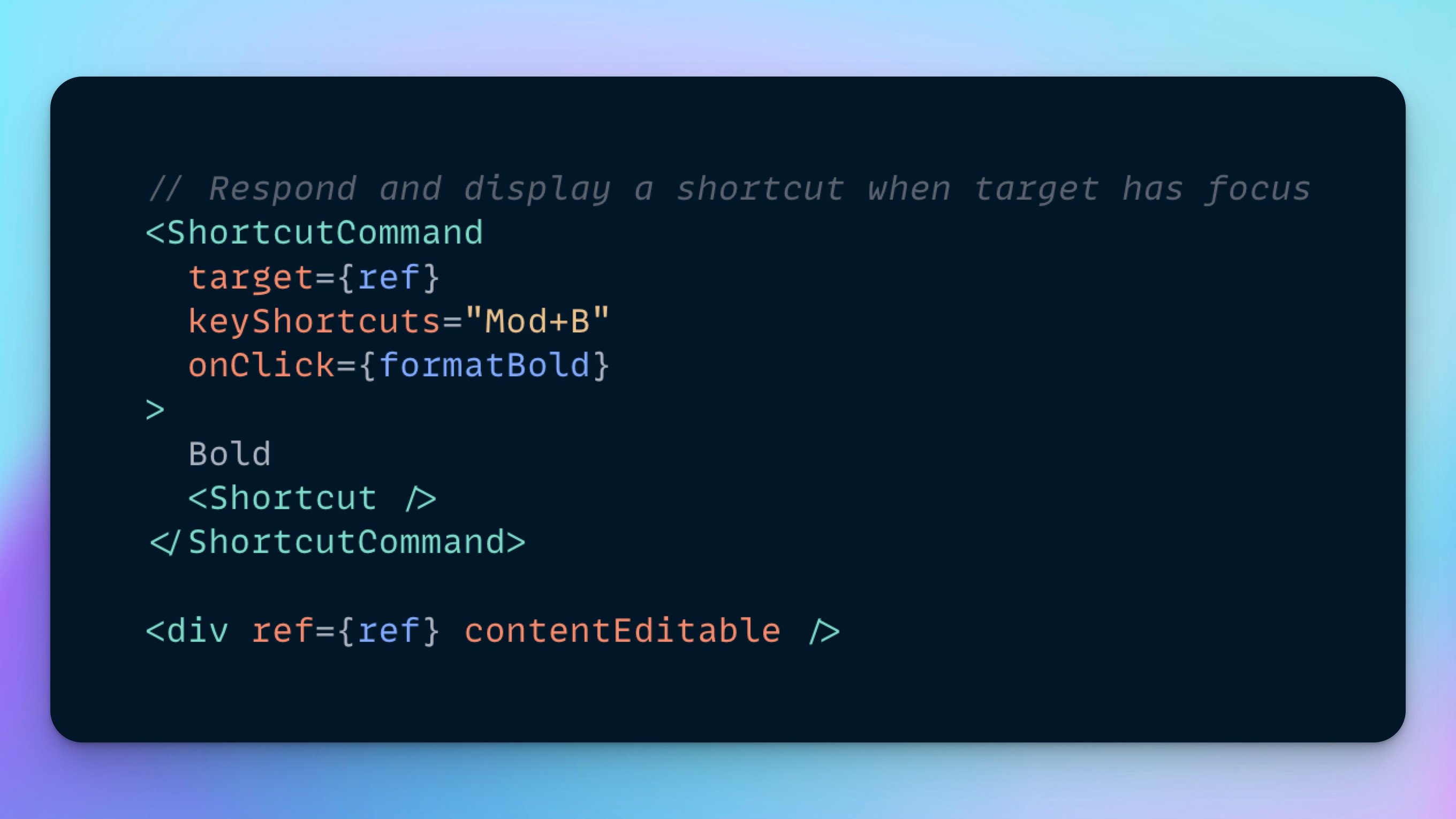
ALT The following JSX code: // Respond and display a shortcut when target has focus <ShortcutCommand target={ref} keyShortcuts="Mod+B" onClick={formatBold} > Bold <Shortcut /> </ShortcutCommand> <div ref={ref} contentEditable />
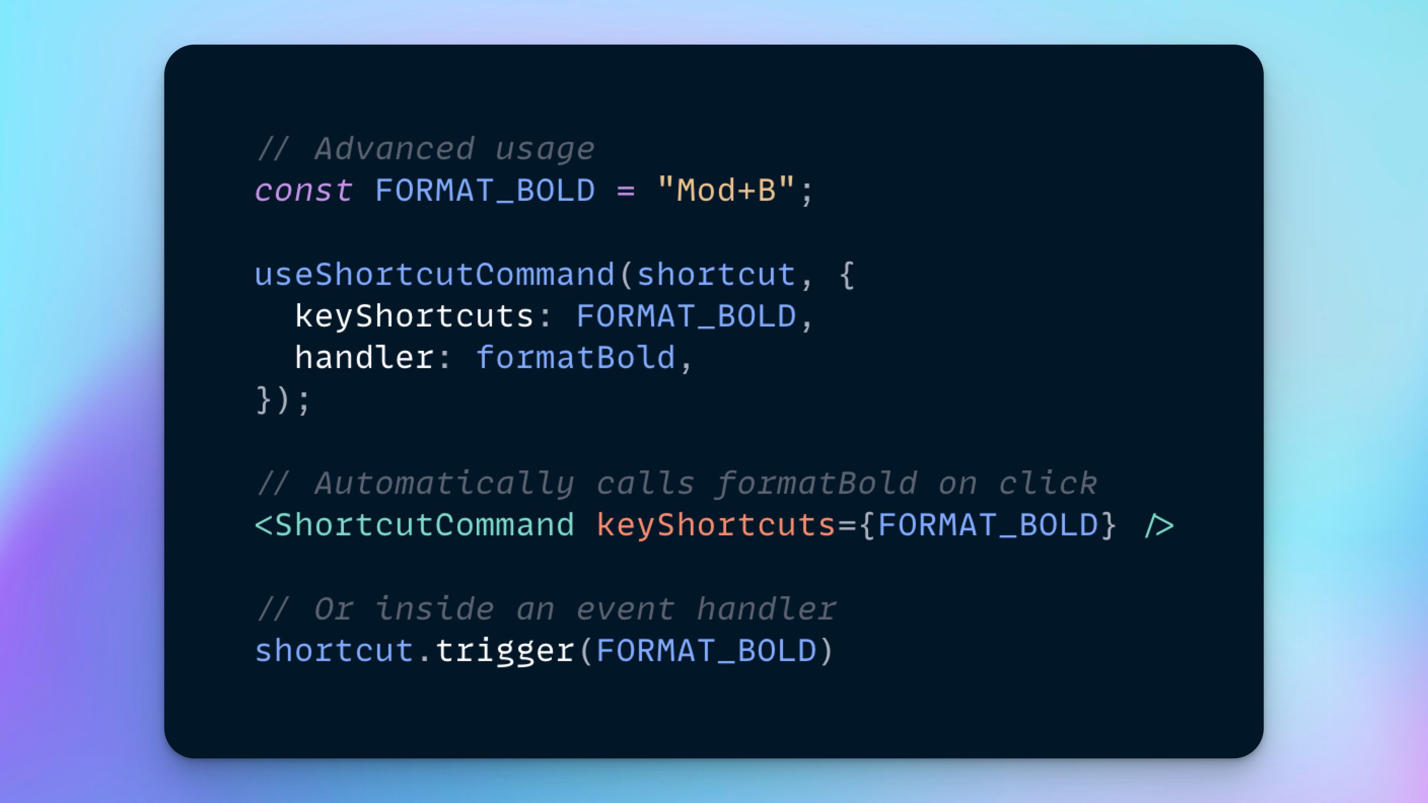
ALT The following JSX code: // Advanced usage const FORMAT_BOLD = "Mod+B"; useShortcutCommand(shortcut, { keyShortcuts: FORMAT_BOLD, handler: formatBold, }); // Automatically calls formatBold on click <ShortcutCommand keyShortcuts={FORMAT_BOLD} /> // Or inside an event handler shortcut.trigger(FORMAT_BOLD)
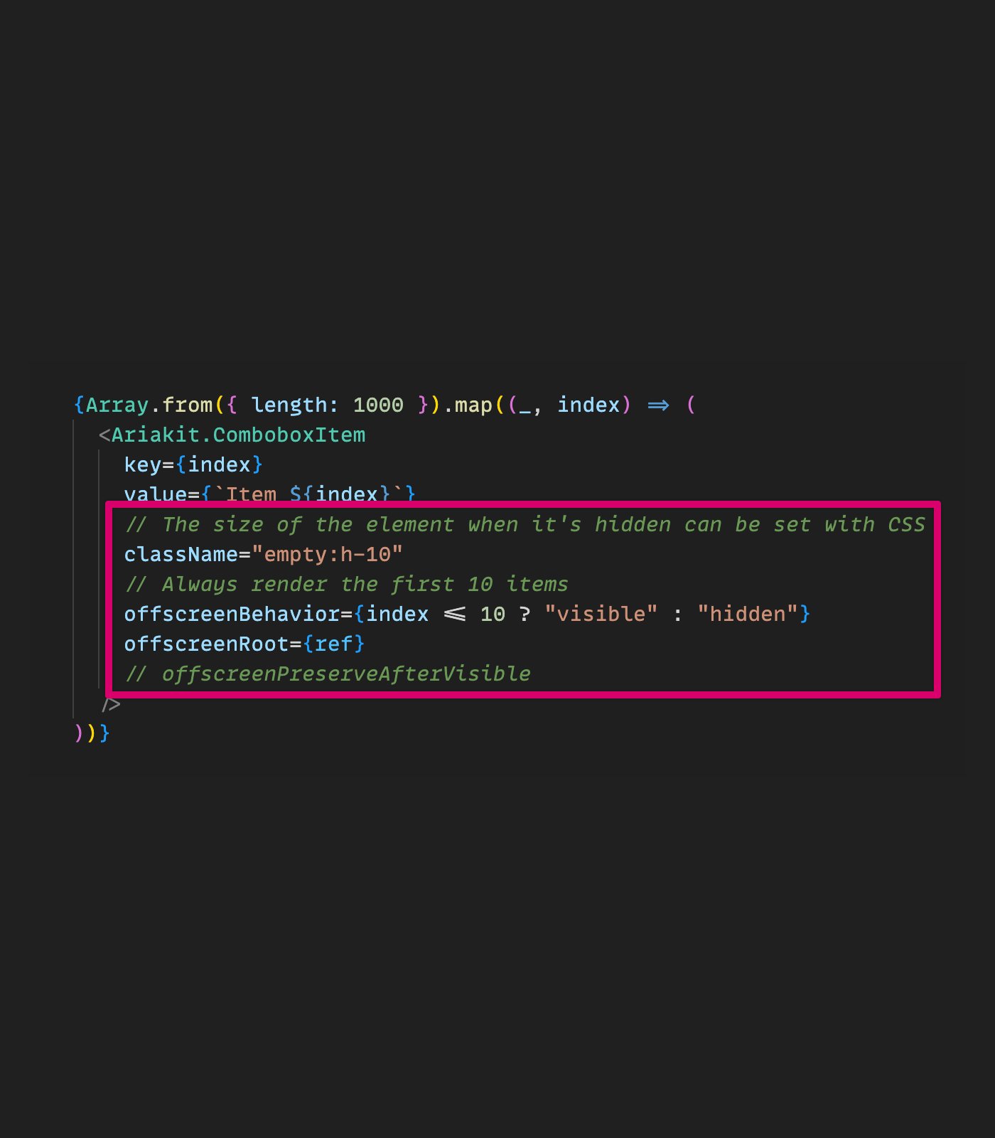
ALT Screenshot of the following JSX code highlighting the usage of "offscreen" props: {Array.from({ length: 1000 }).map((_, index) => ( <Ariakit.ComboboxItem key={index} value={`Item ${index}`} // The size of the element when it's hidden can be set with CSS className="empty:h-10" // Always render the first 10 items offscreenBehavior={index <= 10 ? "visible" : "hidden"} offscreenRoot={ref} // offscreenPreserveAfterVisible /> ))}
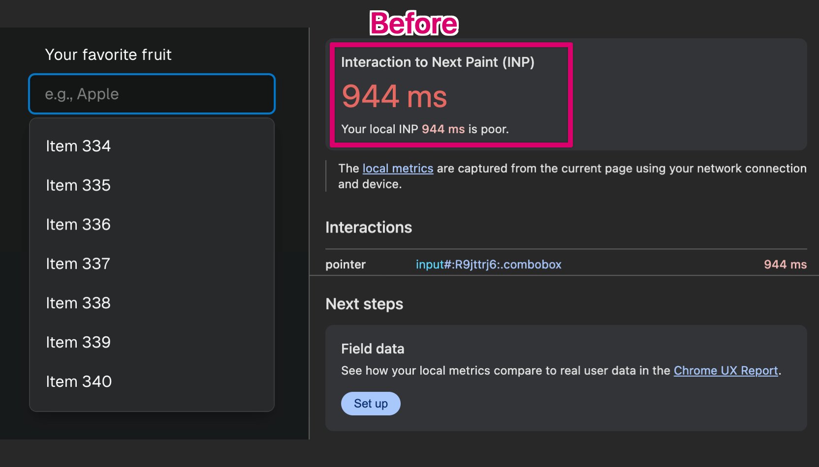
ALT Screenshot of a combobox widget with hundreds of options, highlighting the devtools showing an Interaction to Next Paint (INP) metric of 944ms labeled "Before"
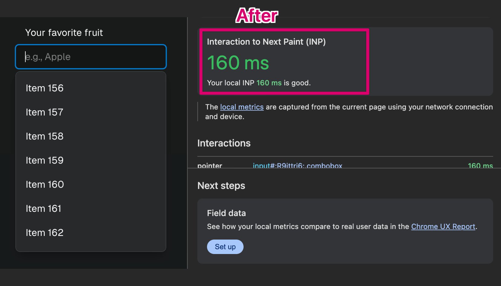
ALT Screenshot of a combobox widget with hundreds of options, highlighting the devtools showing an Interaction to Next Paint (INP) metric of 160ms labeled "After"
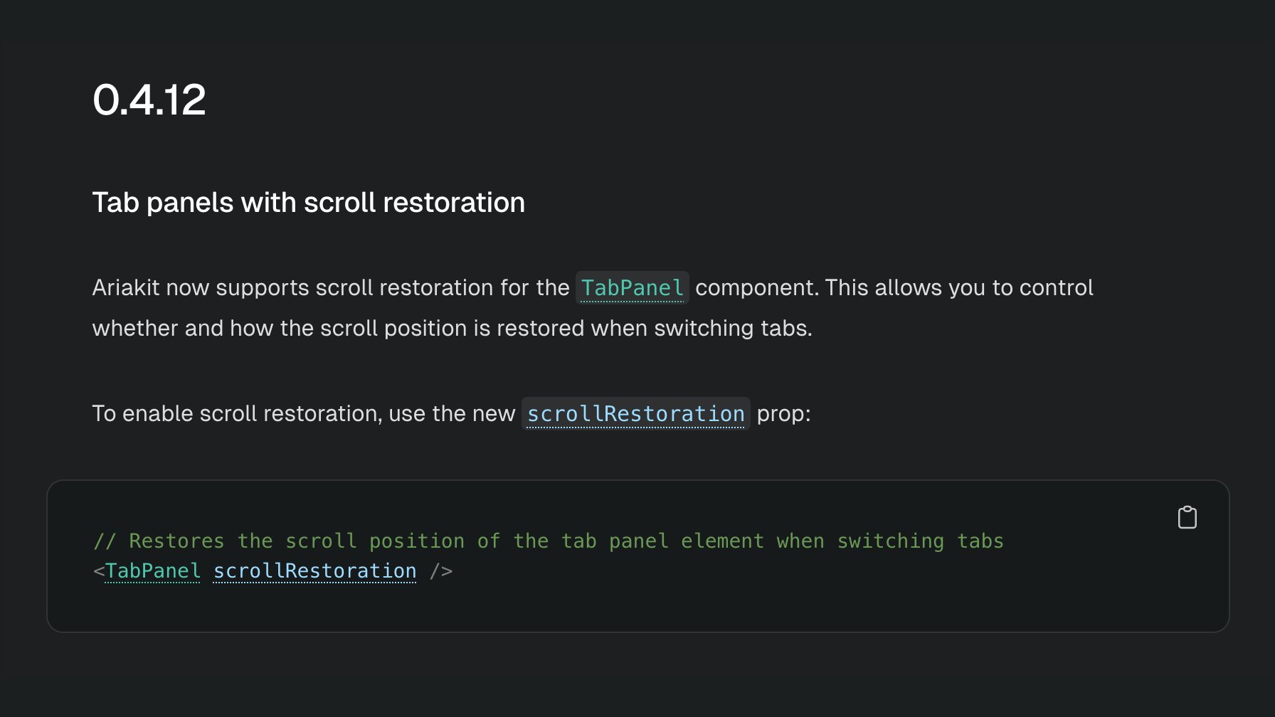
ALT Screenshot of the changelog page linked in the post

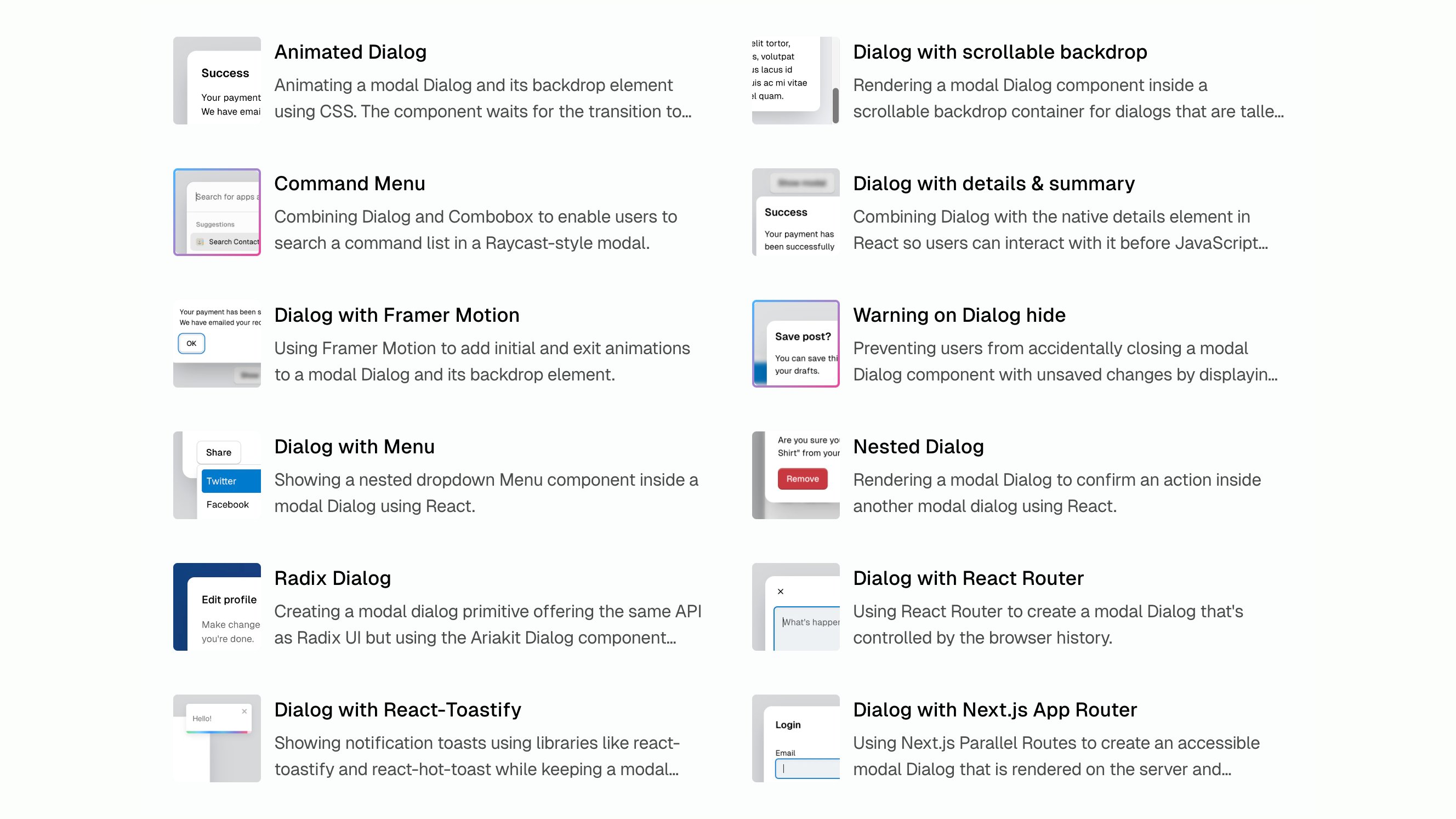
ALT Screenshot of the Ariakit.org examples page
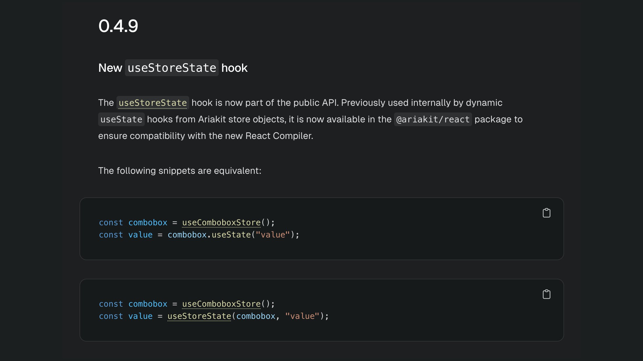
ALT 0.4.9 New useStoreState hook The useStoreState hook is now part of the public API. Previously used internally by dynamic useState hooks from Ariakit store objects, it is now available in the @ariakit/react package to ensure compatibility with the new React Compiler. The following snippets are equivalent: const combobox = useComboboxStore(); const value = combobox.useState("value"); const combobox = useComboboxStore(); const value = useStoreState(combobox, "value");
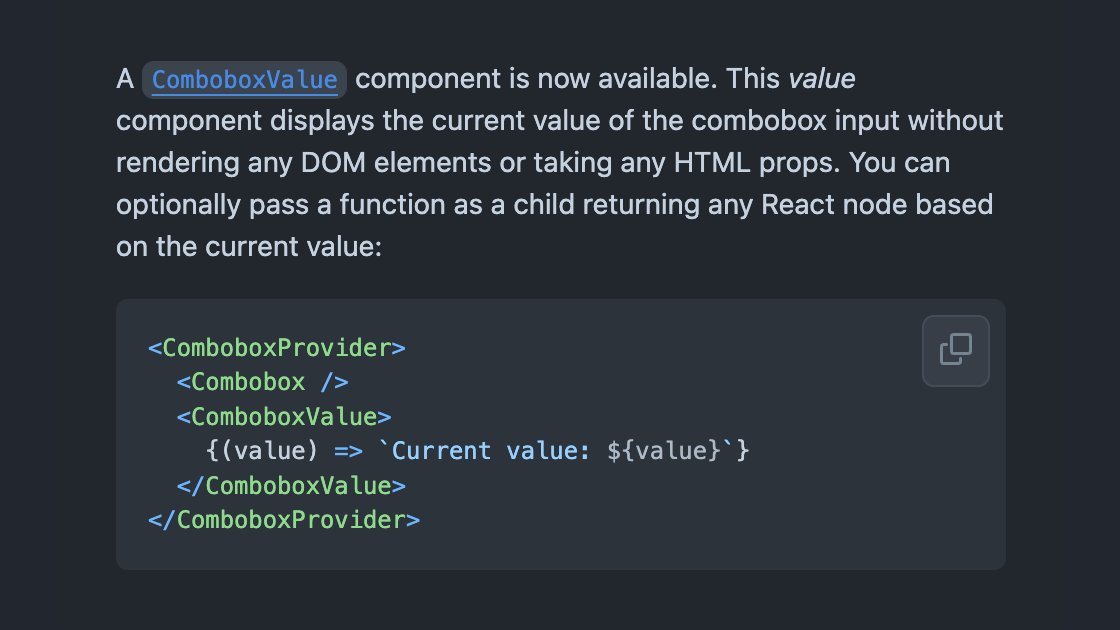
ALT A ComboboxValue component is now available. This value component displays the current value of the combobox input without rendering any DOM elements or taking any HTML props. You can optionally pass a function as a child returning any React node based on the current value: <ComboboxProvider> <Combobox /> <ComboboxValue> {(value) => `Current value: ${value}`} </ComboboxValue> </ComboboxProvider>