
Toolkit with accessible components, styles, and examples for your next web app
- Tweets 556
- Following 4
- Followers 2,570
- Likes 764






Ariakit retweeted

Working on an app that makes it super simple to save/manage links or bookmarks
This is a demo of the associated browser extension. I believe this is the quickest way to bookmark a page 😅
Built with:
@ariakitjs
@tailwindcss
react-hot-toast by @timolins
more on this soon!
3
7
1,249
Ariakit retweeted

I highly appreciate the work that was put in #ReactAria, but it somehow never fully worked out for us. The last days I worked on migrating our selects and comboboxes to @ariakitjs and the result is amazing. It was very easy to work with. Great API, great docs.
1
3
7
1,108
Ariakit retweeted
Menu and Combobox components built with @ariakitjs

4
12
1,783
Ariakit retweeted
I almost always start with the native HTML select element. I reach for @ariakitjs menus and co. when the select element doesn't fit the requirements.
In this case, I believe this is more than good enough at least for the v1 of this.
3
6
831
Ariakit retweeted
Dialogs and Menus built with @ariakitjs @tailwindcss
For the past few weeks, I've been working with @just_frankieee on a super simple way to manage links/bookmarks. Excited to share more about this soon
2
3
1,137
Ariakit retweeted

the @ariakitjs website is amazing: ariakit.org
@diegohaz did an amazing job with it, and the additional features from the paid Ariakit Plus plan make it even better (and help fund it as an OSS project).
2
8
809
Ariakit retweeted

I wish shadcn/ui used @ariakitjs instead of Radix
I love Radix but there are so many times where I want to drop down to eg. a Composite role to build something custom
6
2
53
11,282
Ariakit retweeted

Another good one is not dismissing a sub-menu when the mouse moves towards it, even if it unhovers the parent menu item. Powered by @ariakitjs too.
1
1
4
566
Ariakit retweeted
It works the same way in Todoist. I believe it is a pretty common practice of any good component library these days. We use @ariakitjs, which is insanely good for this and much more.
1
1
4
634
Ariakit retweeted

Ariakit has reached 100k weekly downloads on npm.
Still a long way to go.
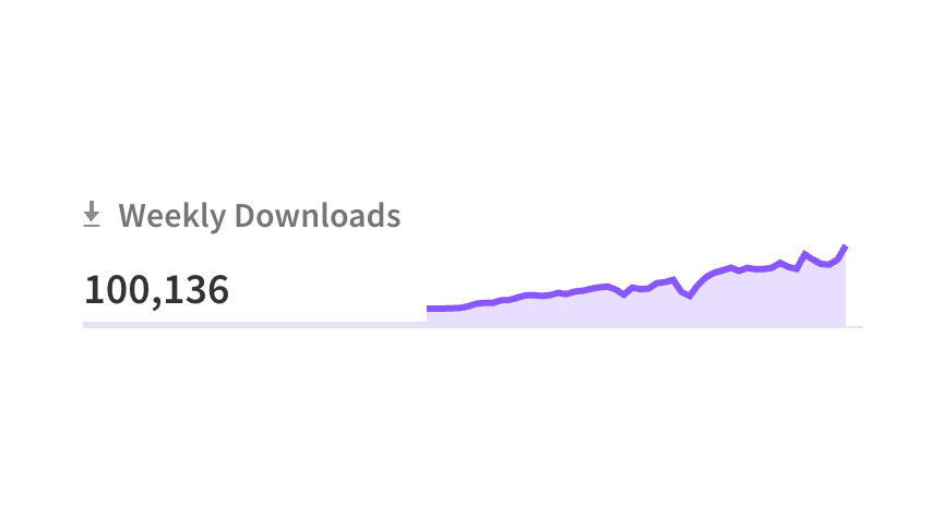
ALT 100,136 weekly downloads
3
4
109
11,385
Ariakit retweeted

I've been working on a major overhaul of our filters with great keyboard support and multi-selection. It's my first time using @ariakitjs and it's now my favourite component library.
6
18
1,773
Ariakit retweeted
The next Ariakit newsletter will be sent out tomorrow.
You can subscribe here: newsletter.ariakit.org
Read the previous post: newsletter.ariakit.org/p/ani…
2
7
33
3,433
Ariakit retweeted
✨ New example: Select with Combobox and Tab
A custom Select component that can be used to create anything from a simple custom select widget to a searchable, tabbed one.
Demo: ariakit.org/examples/select-…
4
20
297
28,998
Ariakit retweeted
@ariakit/react v0.4.6 has been released with new Select features.
You can now have non-composite items within SelectPopover without breaking the accessibility tree: just render SelectItem elements inside SelectList and everything else outside of it.
New example soon 🔜
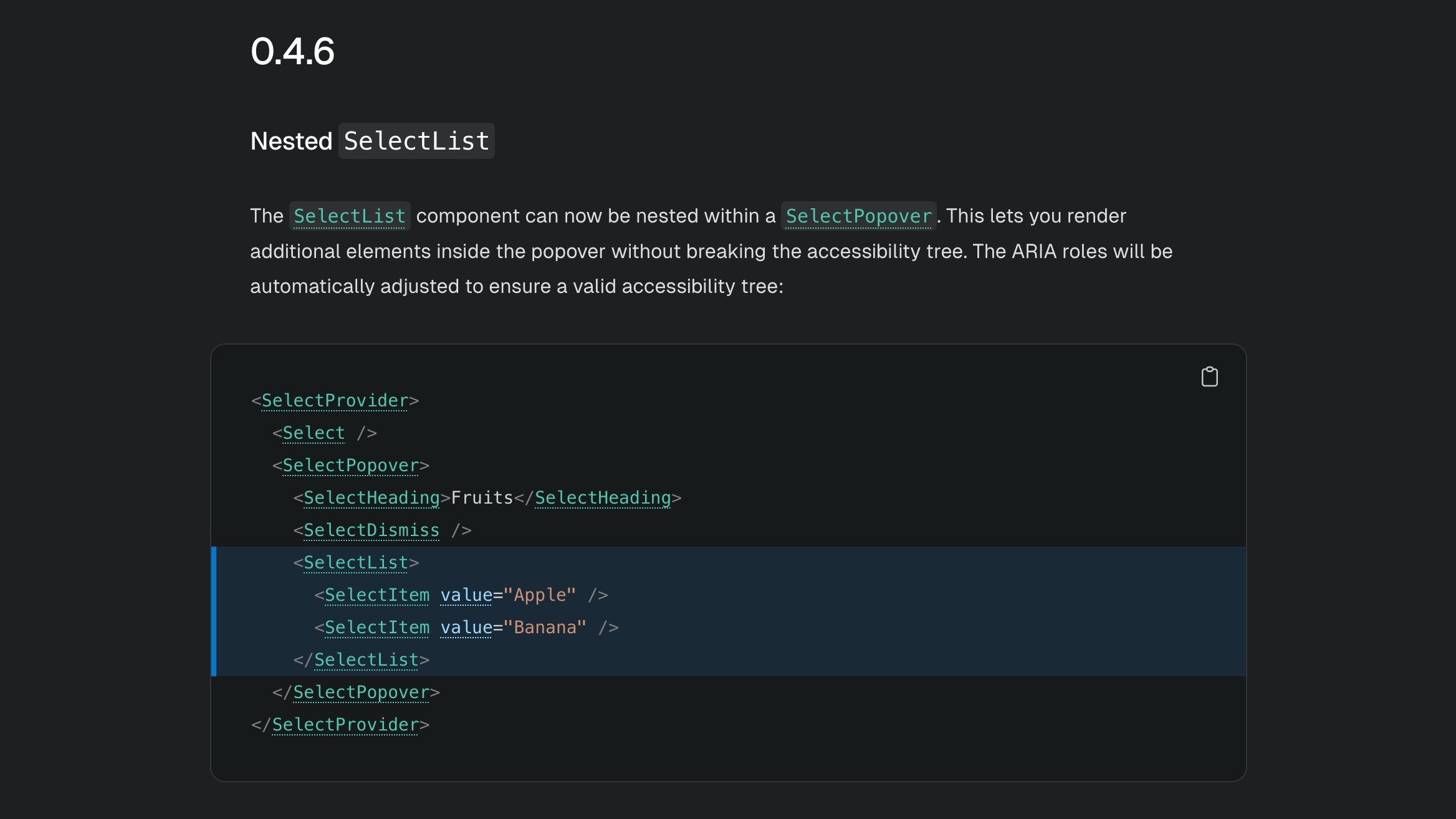
ALT Screenshot of a changelog section with the following content: 0.4.6 Nested SelectList The SelectList component can now be nested within a SelectPopover. This lets you render additional elements inside the popover without breaking the accessibility tree. The ARIA roles will be automatically adjusted to ensure a valid accessibility tree: <SelectProvider> <Select /> <SelectPopover> <SelectHeading>Fruits</SelectHeading> <SelectDismiss /> <SelectList> <SelectItem value="Apple" /> <SelectItem value="Banana" /> </SelectList> </SelectPopover> </SelectProvider>
6
56
4,066
Ariakit retweeted

bro's been COOKING
ariakit is still the best headless lib I've used in so many metrics lmao

2
3
32
4,902