
Toolkit with accessible components, styles, and examples for your next web app
- Tweets 556
- Following 4
- Followers 2,569
- Likes 764








ALT A screenshot of the Ariakit documentation on the exact section linked in the post.
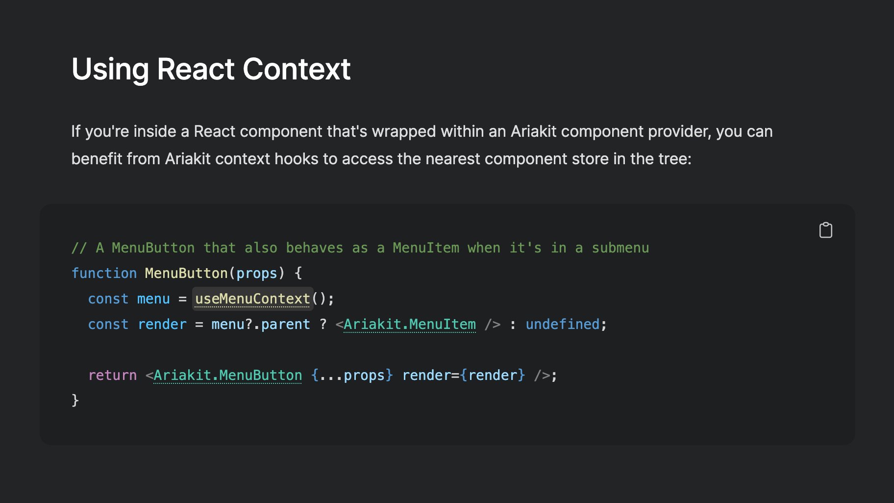
ALT Screenshot of the page linked in the post with the following text: Using React Context If you're inside a React component that's wrapped within an Ariakit component provider, you can benefit from Ariakit context hooks to access the nearest component store in the tree: // A MenuButton that also behaves as a MenuItem when it's in a submenu function MenuButton(props) { const menu = useMenuContext(); const render = menu?.parent ? <Ariakit.MenuItem /> : undefined; return <Ariakit.MenuButton {...props} render={render} />; }
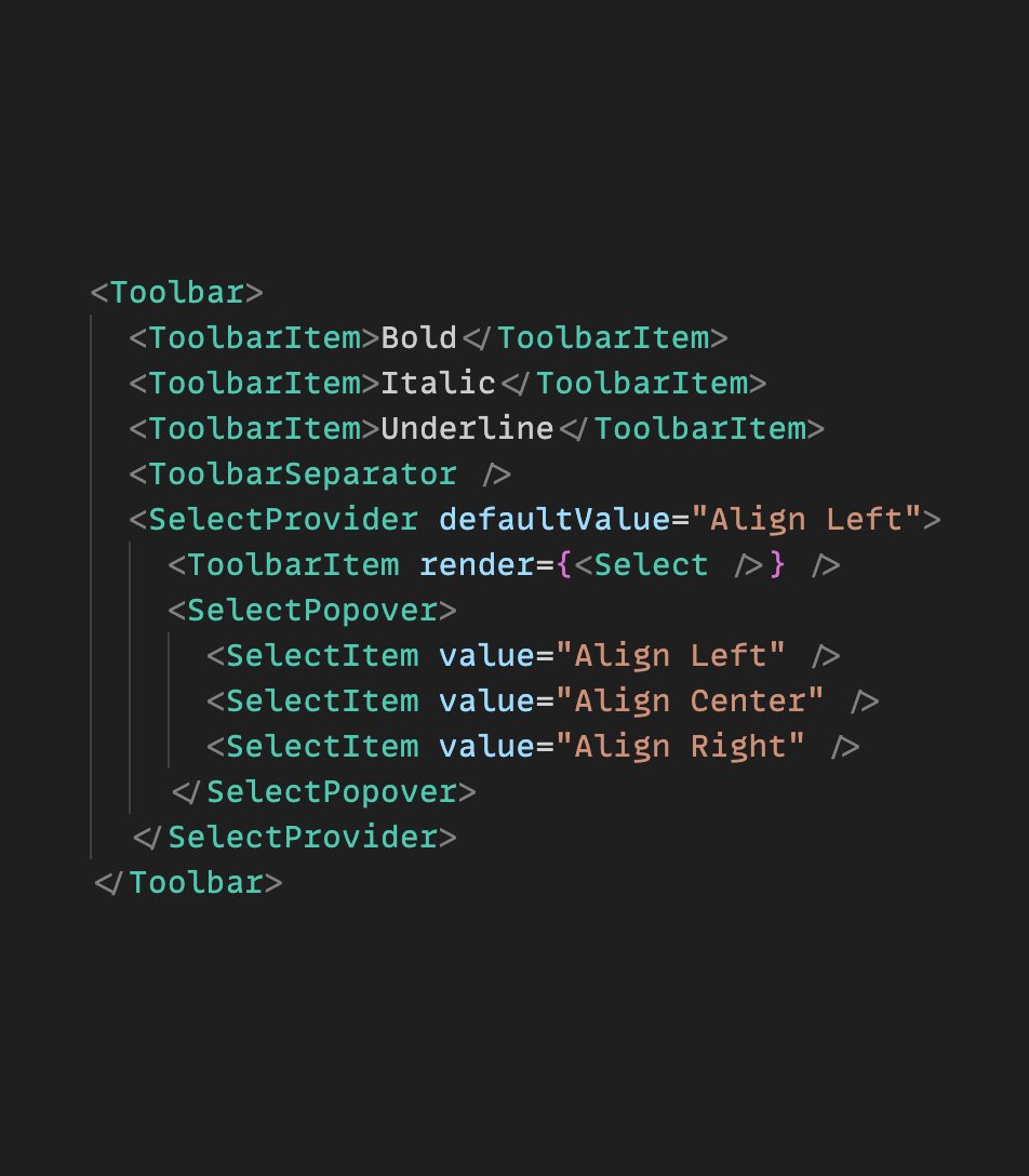
ALT The following JSX snippet: <Toolbar> <ToolbarItem>Bold</ToolbarItem> <ToolbarItem>Italic</ToolbarItem> <ToolbarItem>Underline</ToolbarItem> <ToolbarSeparator /> <SelectProvider defaultValue="Align Left"> <ToolbarItem render={<Select />} /> <SelectPopover> <SelectItem value="Align Left" /> <SelectItem value="Align Center" /> <SelectItem value="Align Right" /> </SelectPopover> </SelectProvider> </Toolbar>
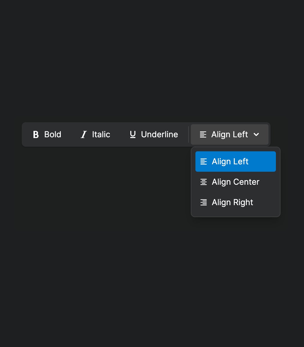
ALT A screenshot of a toolbar widget with a custom select button.
![The following React component code:
const [value, setValue] = useState("");
const matches = matchSorter(list, value);
<ComboboxProvider value={value} setValue={setValue}>
<SelectProvider defaultValue="Apple">
<Select />
<SelectPopover>
<Combobox placeholder="Search..." />
<ComboboxList>
{matches.map((value) => (
<SelectItem
key={value}
value={value}
render={<ComboboxItem />}
/>
))}
</ComboboxList>
</SelectPopover>
</SelectProvider>
</ComboboxProvider>](/pic/orig/media%2FF5XIyfkW4AEZhl3.jpg)
ALT The following React component code: const [value, setValue] = useState(""); const matches = matchSorter(list, value); <ComboboxProvider value={value} setValue={setValue}> <SelectProvider defaultValue="Apple"> <Select /> <SelectPopover> <Combobox placeholder="Search..." /> <ComboboxList> {matches.map((value) => ( <SelectItem key={value} value={value} render={<ComboboxItem />} /> ))} </ComboboxList> </SelectPopover> </SelectProvider> </ComboboxProvider>
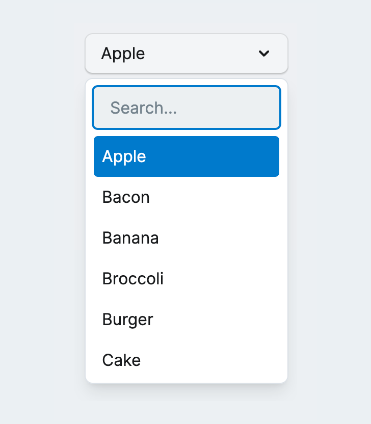
ALT Screenshot of a select widget with a search field inside the select popup
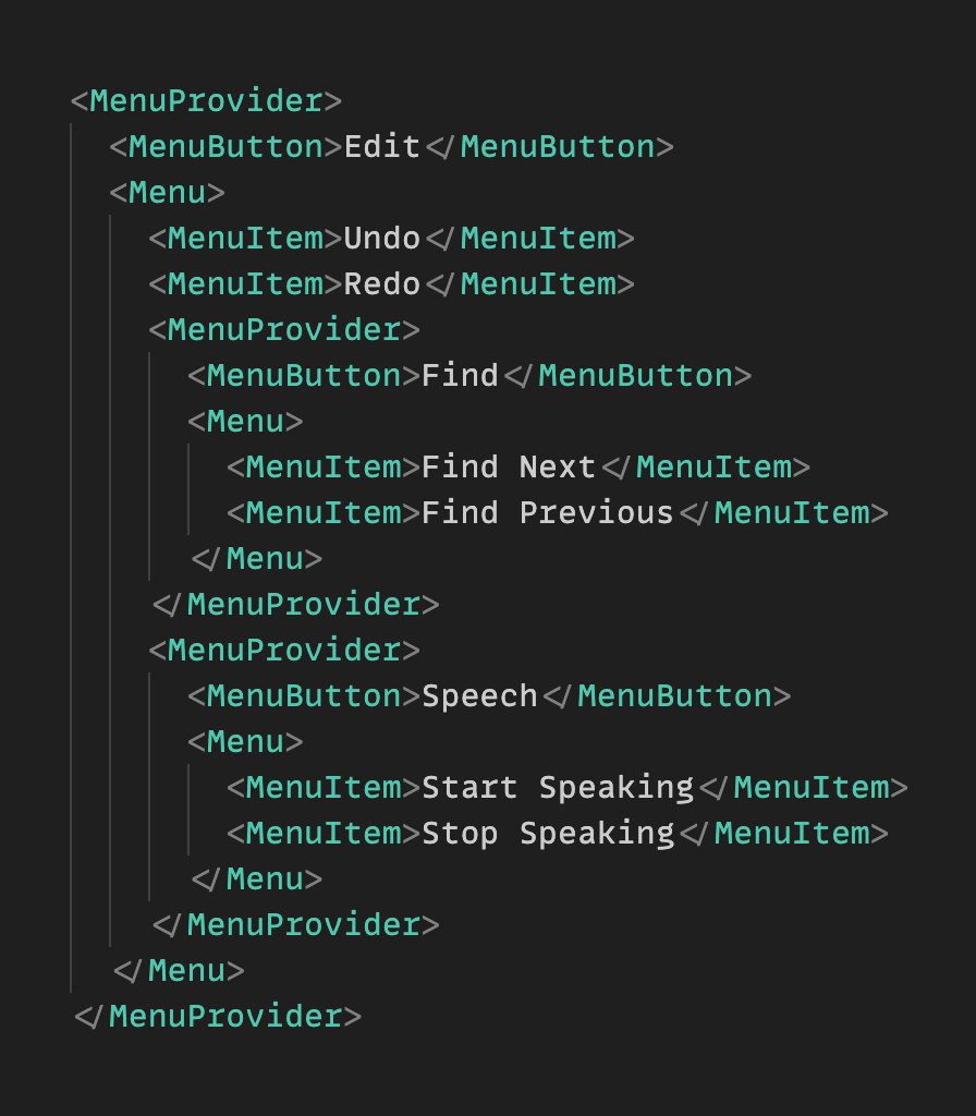
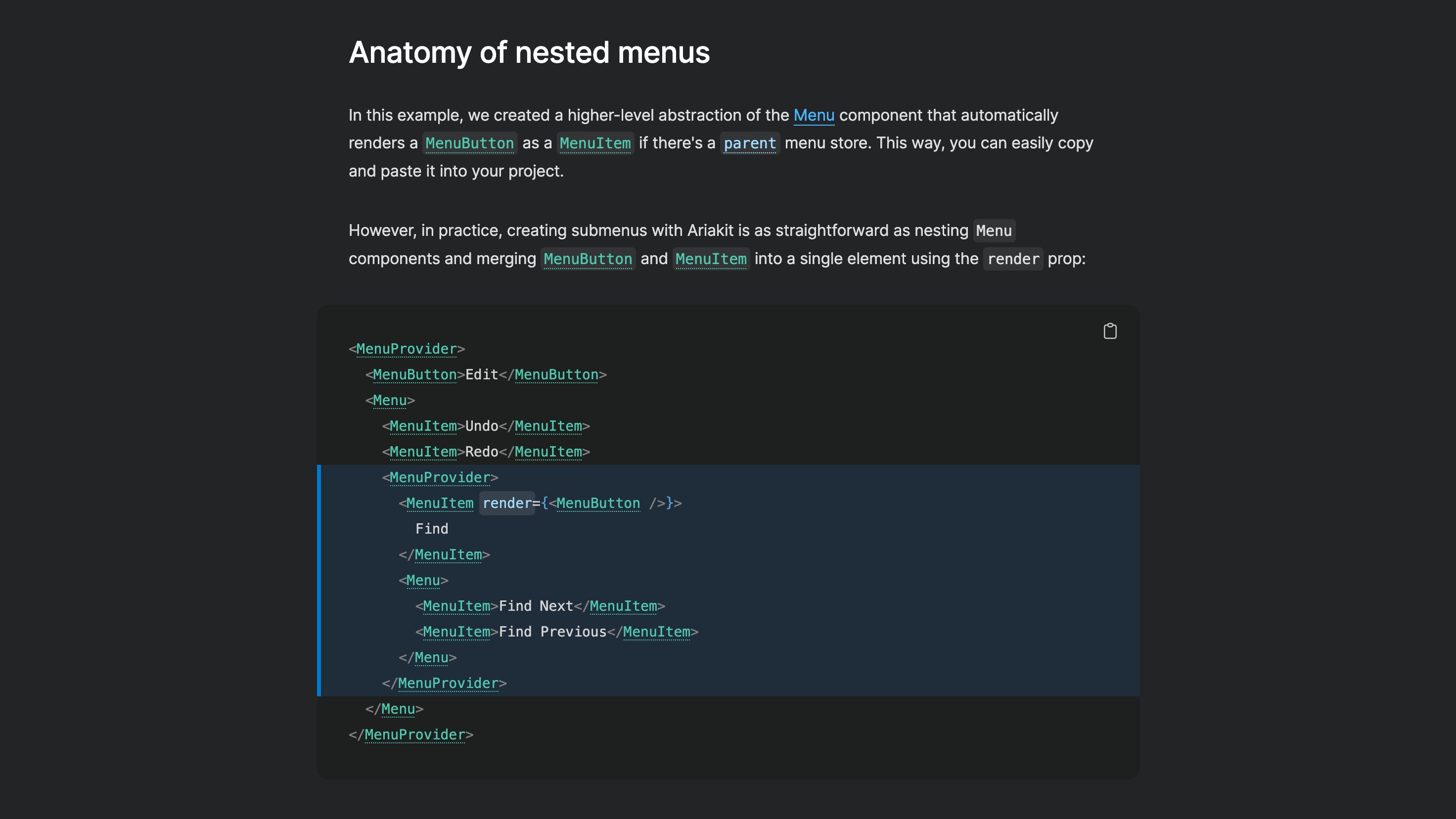
ALT The following JSX code: <MenuProvider> <MenuButton>Edit</MenuButton> <Menu> <MenuItem>Undo</MenuItem> <MenuItem>Redo</MenuItem> <MenuProvider> <MenuButton>Find</MenuButton> <Menu> <MenuItem>Find Next</MenuItem> <MenuItem>Find Previous</MenuItem> </Menu> </MenuProvider> <MenuProvider> <MenuButton>Speech</MenuButton> <Menu> <MenuItem>Start Speaking</MenuItem> <MenuItem>Stop Speaking</MenuItem> </Menu> </MenuProvider> </Menu> </MenuProvider>
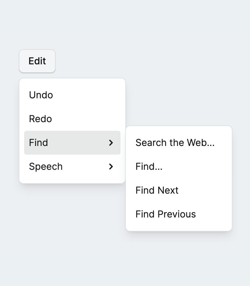
ALT A screenshot of an Edit menu button with 4 items: Undo, Redo, Find, Speech. The last two items, Find and Speech, are sub-menu buttons. The Find submenu is open.
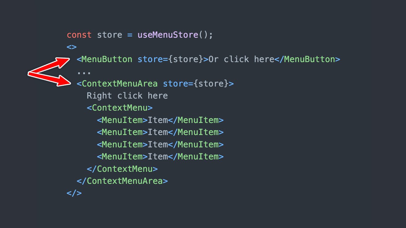
ALT The following code: const store = useMenuStore(); <> <MenuButton store={store}>Or click here</MenuButton> ... <ContextMenuArea store={store}> Right click here <ContextMenu> <MenuItem>Item</MenuItem> <MenuItem>Item</MenuItem> <MenuItem>Item</MenuItem> <MenuItem>Item</MenuItem> </ContextMenu> </ContextMenuArea> </>

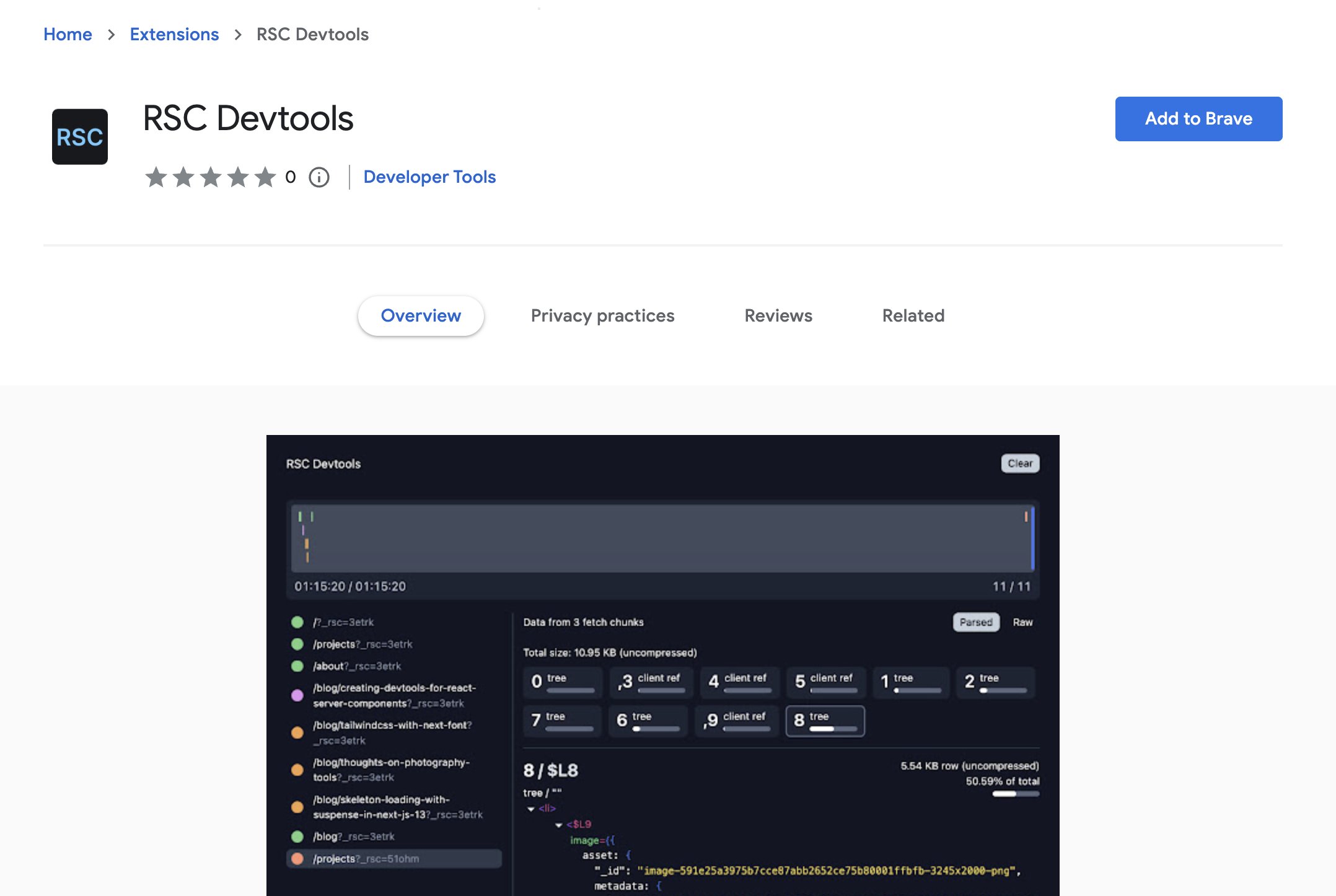
ALT Screenshot of the RSC Devtools extension page on the Chrome Web store.

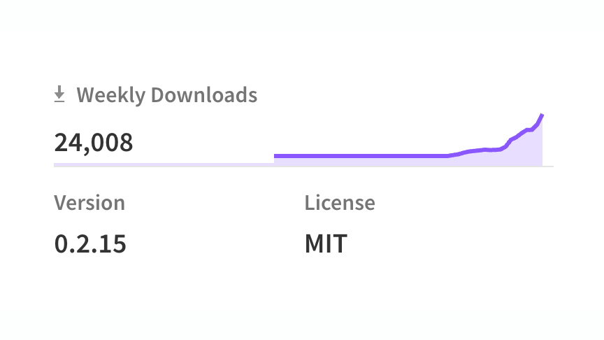
ALT Screenshot of npm statistics showing 24k weekly downloads
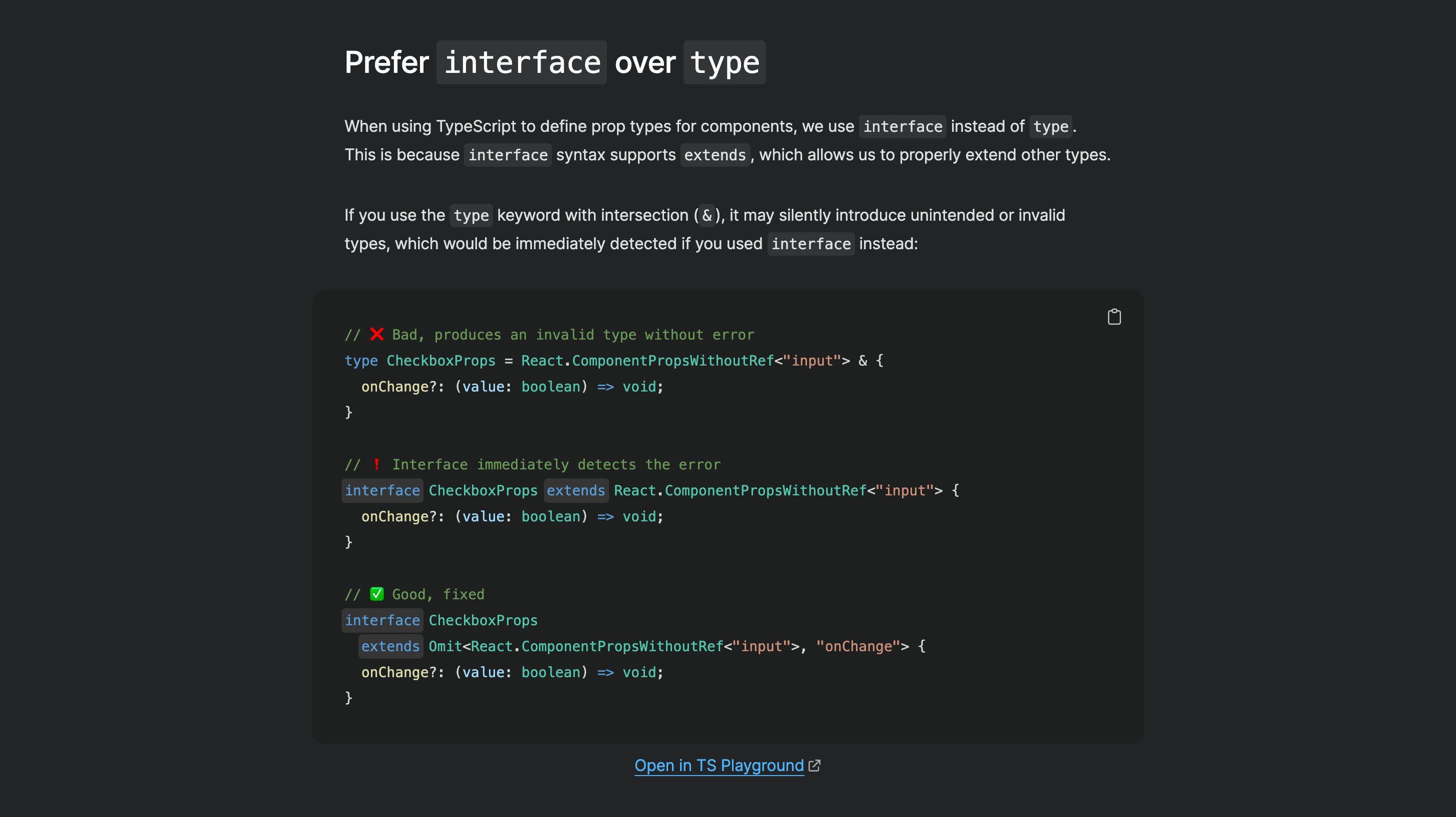
ALT Screenshot of the "Prefer interface over type" section from the page linked in the post
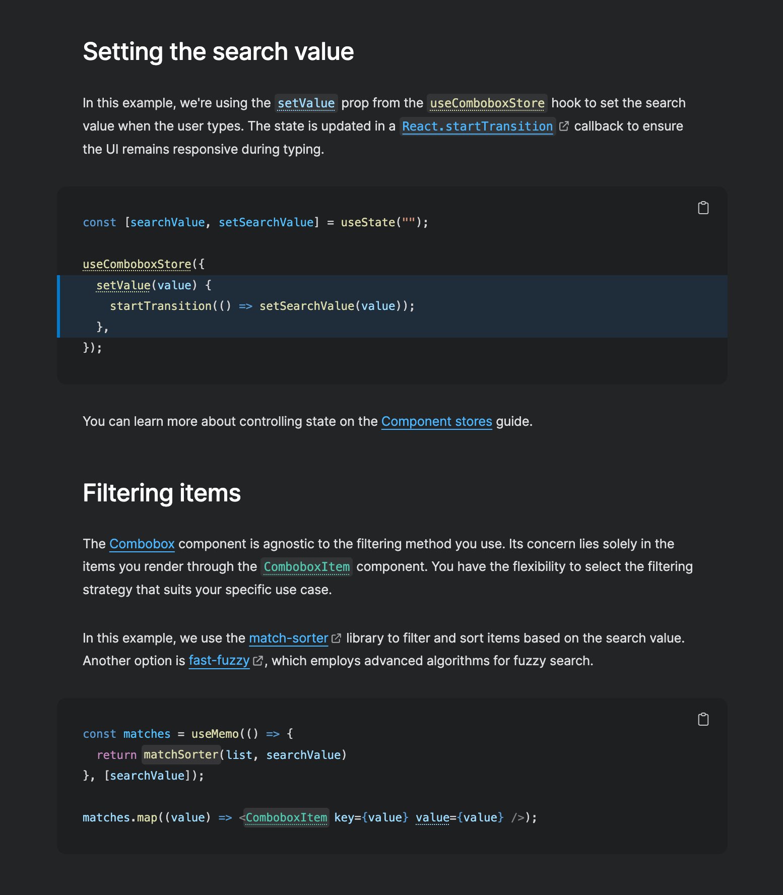
ALT Screenshot of the "Setting the search value" and "Filtering items" sections on the Combobox filtering page linked in the tweet
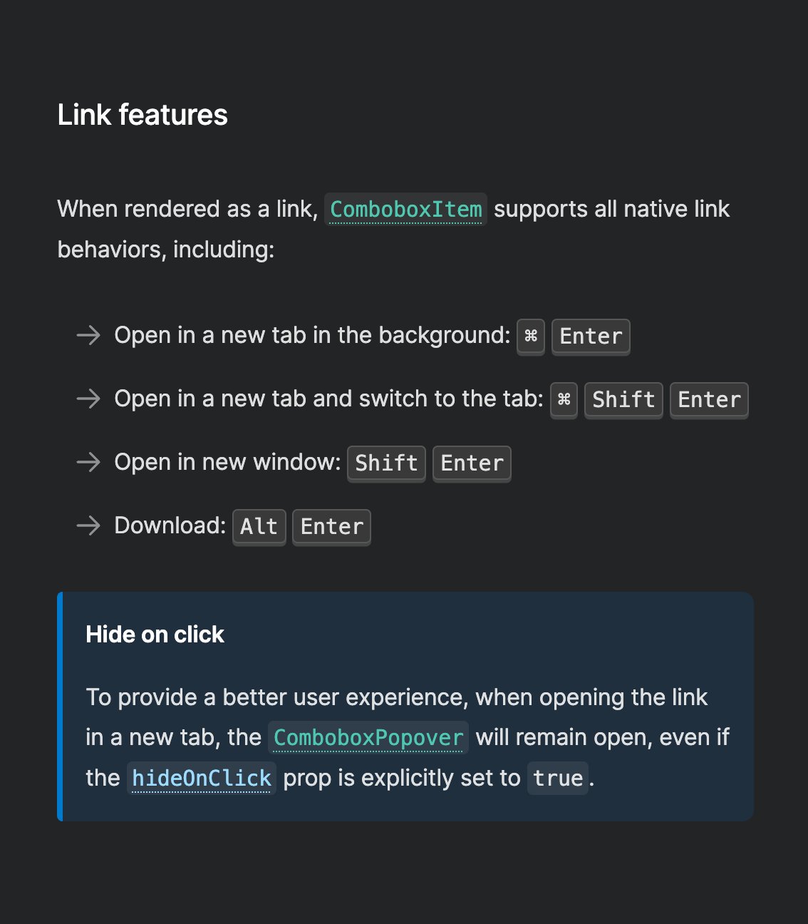
ALT Screenshot of a section of Ariakit's docs page with the following text: Link features When rendered as a link, ComboboxItem supports all native link behaviors, including: Open in a new tab in the background: ⌘ Enter Open in a new tab and switch to the tab: ⌘ Shift Enter Open in new window: Shift Enter Download: Alt Enter Hide on click To provide a better user experience, when opening the link in a new tab, the ComboboxPopover will remain open, even if the hideOnClick prop is explicitly set to true.
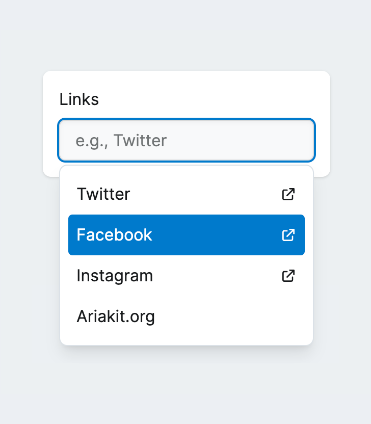
ALT Screenshot of Ariakit's Combobox component with links