
Toolkit with accessible components, styles, and examples for your next web app
- Tweets 556
- Following 4
- Followers 2,569
- Likes 767




Ariakit retweeted

Testing a component with Jest, React Testing Library, and Ariakit Test Utils.
11
67
759
Ariakit retweeted
I'm building an accessible GitHub-like textarea using the Ariakit Combobox component.
9
18
235
Ariakit retweeted
I'm integrating Floating UI with Ariakit, and I'm very impressed with the result.
11
19
261
Ariakit retweeted
Testing the Ariakit Combobox component with groups using NVDA (screen reader for Windows).
It announces the group label when you focus on an item inside the group.
🔈 Sound on
1
2
17
Ariakit retweeted
The new Select component has finally been shipped with the latest alpha version of Ariakit.
- Lower-level components.
- Bring your own styles.
- Proper semantics and screen reader support.
- Automatic focus management.
- Keyboard support.
And more... 🧵
3
20
162
Ariakit retweeted
Custom Select component with groups:
<Select />
<SelectPopover>
<SelectGroup>
<SelectGroupLabel />
<SelectItem />
</SelectGroup>
</SelectPopover>
a11y details in the thread 🧵
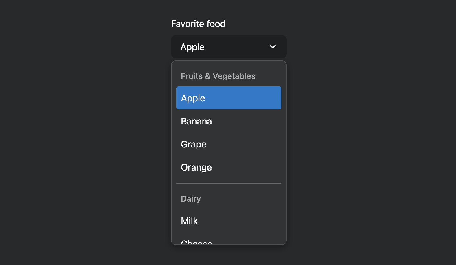
ALT Screenshot of a custom select component with groups
2
2
43
Ariakit retweeted
Created this multi-selectable combo box widget by combining the Ariakit Combobox and Select components.
More info in the thread 🧵
2
3
27


Ariakit retweeted
Getting back to work on the Ariakit Select component. Testing now the integration with Form.
🧵
2
2
33
Ariakit retweeted
Building a dropdown menu with a search field using Ariakit ✨
There's no specific component for this. We just combine the lower-level Menu and Combobox components. They're flexible enough to work nicely together.
1
9
73
Ariakit retweeted
Fun experiment: I re-created the macOS menu bar using React (and Ariakit components) ✨
3
9
192
Ariakit retweeted
Building simple higher-level APIs using the Ariakit primitive components:
<Menu>
<MenuItem />
<Menu>
<MenuItem />
<MenuItem />
</Menu>
</Menu>
1
8
66